
Four out of five real estate website visitors now arrive on a phone or tablet, according to Luxury Presence’s 2026 mobile analysis, yet desktop devices still produce a disproportionately larger share of actual lead conversions. That gap between where traffic originates and where it converts is the single biggest source of lost business for agents who’ve invested in their web presence.
TL;DR: Mobile accounts for roughly 80% of real estate web traffic but converts at far lower rates than desktop. Navigation depth, multi-field forms, misplaced CTAs, and slow page loads are the fixable causes. Treating mobile as the primary design target closes the gap faster than any visual redesign.
Desktop Navigation Crammed Into a Phone Screen
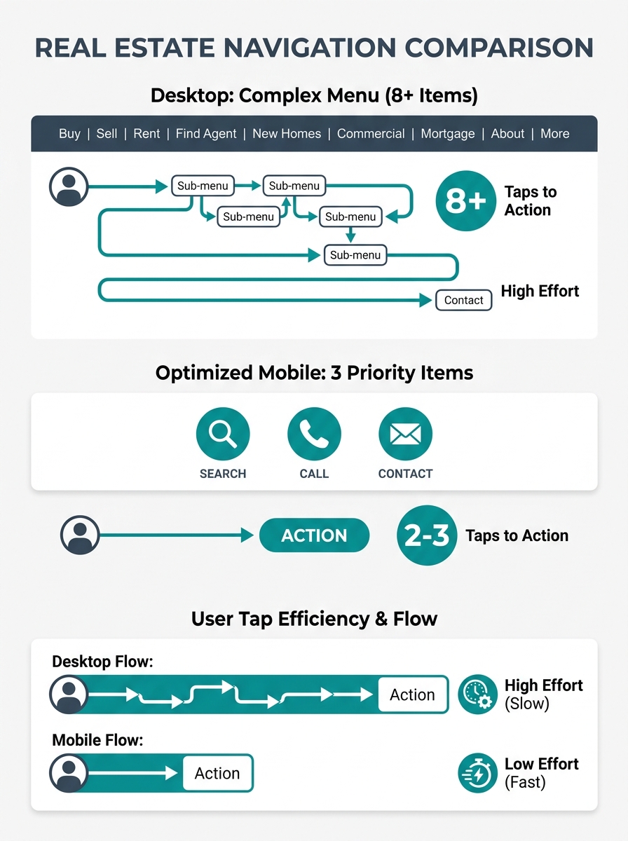
The default approach to mobile real estate website design is to shrink the desktop layout into a hamburger menu and ship it. This creates a structure where property search, contact pages, and listing details hide behind 2-3 taps instead of being immediately visible. A conversion study across 147 real estate websites by UpRealer found that desktop devices consistently produce more total conversions despite receiving a minority of traffic. Navigation friction is a primary contributor.
The Nielsen Norman Group’s foundational mobile navigation research states one principle clearly: “prioritize content over chrome.” For a real estate site, “content” means the property search bar, the agent’s phone number, and the lead capture form. “Chrome” means the logo, the About page link, the testimonials carousel, and the social media icons that fill your hamburger menu’s first screen.
When a buyer lands on your site from a Google search for “3-bedroom homes in [neighborhood],” they want to see listings. If they have to tap a hamburger icon, scroll past 8 menu items, find “Search Properties,” and then wait for a filter-heavy IDX page to load, you’ve already lost the impatient visitors. And on mobile, nearly everyone is impatient. Google’s own benchmarking data shows 53% of mobile users abandon pages that take longer than 3 seconds to load.
Forms That Punish Thumb Typing
Mobile visitors abandon contact forms at higher rates than desktop users because typing on a phone is slow and frustrating, and most real estate lead capture forms were designed for keyboards.
A form asking for first name, last name, email, phone number, message, preferred price range, and preferred neighborhoods requires 7 field taps and significant typing on a 6-inch screen. According to WiserNotify’s conversion rate analysis, simplifying forms to three fields — name, email, and phone — directly improves lead conversion rates. Every additional field reduces completion, and the reduction is steeper on mobile because the input cost per field is higher.
The 52% form abandonment rate cited in mobile UX research applies squarely to real estate. Buyers browsing listings during a lunch break or sitting in a parked car outside an open house won’t fill out a 7-field form. They’ll call the agent whose number is visible, or they’ll leave and find the listing on Zillow instead.
If you’ve already worked through CTA button placement on your site, the next audit target is what happens after someone taps that button. A single-field email capture or a click-to-call button converts mobile visitors at rates that multi-field forms can’t match.
Tip: Pull up your own site on your phone right now, navigate to your contact form, and time how long it takes to complete. If it takes more than 30 seconds of typing, you’re losing leads to friction that a simpler form would eliminate.
Thumb Zones Determine Whether Anyone Taps Your CTA
The bottom third of a phone screen is where thumbs naturally rest. The top third requires a deliberate reach. On screens larger than 6 inches, the upper-left corner is functionally unreachable for one-handed use. This ergonomic reality should dictate where you place every conversion element on your mobile real estate site.
Agents who redesigned their mobile layouts to place primary CTAs in the thumb-friendly bottom zone saw bounce rate reductions of up to 55%, based on mobile UX case studies tracking responsive real estate navigation patterns. A floating “Call Now” button anchored to the bottom of the screen, visible on every page, removes the need for any navigation at all. The visitor doesn’t have to find your contact page. The contact page finds them.
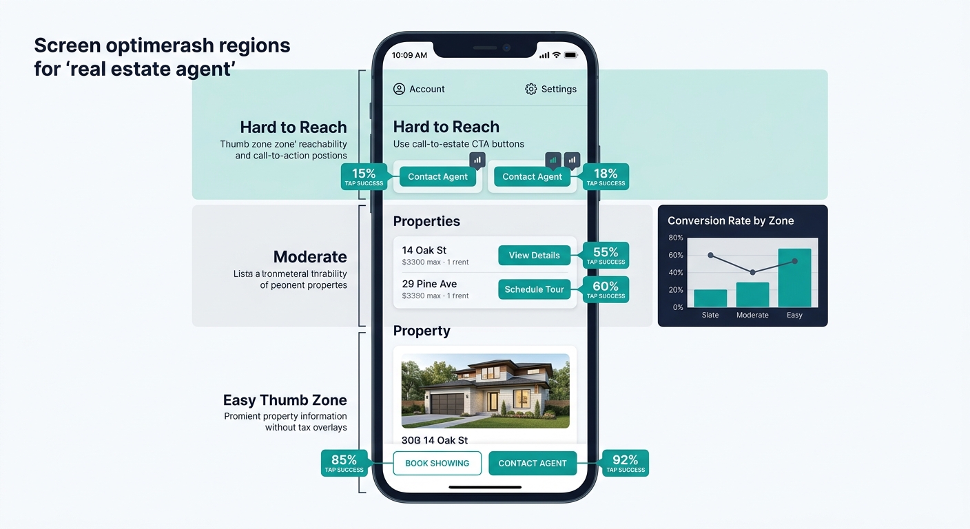
The hamburger menu icon typically sits in the top-right or top-left corner, which is the hardest spot for a thumb to reach. If your most important actions — search properties, call agent, schedule showing — are buried inside that menu, you’ve placed your conversion points in the least accessible location on the screen.
The visitor doesn’t have to find your contact page. The contact page finds them.
A better pattern: a persistent bottom navigation bar with 3-4 icons (Search, Saved, Call, Menu). This keeps primary actions within thumb reach at all times and pushes secondary navigation items like About, Blog, and Testimonials into the overflow menu. The architecture we outlined in our guide to mobile-first property search navigation follows this exact principle, and it maps well to how buyers actually interact with property search mobile UX.
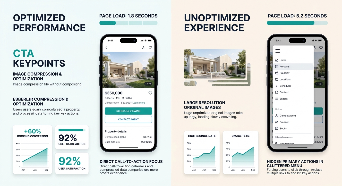
Speed Compounds Every Navigation Problem
A slow-loading page makes every other mobile UX problem worse. If your hamburger menu takes 1.5 seconds to animate open, the search page takes another 3 seconds to load, and the listing detail page takes 2 more, a buyer has waited 6.5 seconds before seeing a single property photo. Each additional second of load delay reduces conversion rates by an average of 4.42%.
Google’s mobile-first indexing means your mobile page speed directly determines your search rankings. The March 2026 core update tightened the Largest Contentful Paint threshold to 2.0 seconds for a “good” score, down from the previous 2.5 seconds. Sites that miss this benchmark lose ranking positions to competitors who hit it, compounding the traffic loss from poor mobile conversion. We covered the full impact of these speed benchmarks on Core Web Vitals and real estate lead loss in depth.
Property image galleries are the usual culprit. A listing page with 25 high-resolution photos loaded all at once will blow past any speed threshold on a cellular connection. Lazy loading, where images render only as the visitor scrolls to them, is the minimum viable fix. WebP or AVIF image formats cut file sizes by 25-50% compared to JPEG without visible quality loss.
IDX integration adds another speed layer. If your MLS feed pulls listing data through an iframe or heavy JavaScript widget, the search page carries the performance cost of two sites loading simultaneously. Sites with native MLS connectivity tend to load faster because they serve listing data from their own servers rather than embedding a third-party widget.
The Desktop-to-Mobile Conversion Gap in Numbers
UpRealer’s study of 147 real estate websites quantified what many agents sense but can’t prove: desktop devices produce more conversions despite receiving far less traffic. This pattern holds across different brokerage sizes, markets, and website platforms.
| Metric | Desktop | Mobile |
|---|---|---|
| Share of total traffic | ~20-25% | ~75-80% |
| Average pages per session | 4.2 | 2.1 |
| Form completion rate | Higher | Lower |
| Average session duration | Longer | Shorter |
| Bounce rate | Lower | Higher |
The pages-per-session gap is revealing. Desktop visitors browse about twice as many pages, meaning they engage with more listings, read more content, and encounter more conversion points. Mobile visitors often see one or two pages and leave. Given the low conversion rate, they’re almost certainly leaving because navigation friction made continued browsing too difficult rather than because they found what they needed.
Improving how your site organizes information for mobile visitors — putting the most-searched features within one tap, reducing the path from landing page to lead form — closes this gap more effectively than any visual redesign. The agents seeing 300% improvements in mobile lead generation aren’t rebuilding their sites from scratch. They’re removing obstacles between the visitor and the three things that matter: search, call, and contact.
What Remains Unresolved
Several aspects of real estate mobile optimization lack enough data for firm recommendations. Progressive Web Apps (PWAs) for real estate sites show early promise in engagement metrics but don’t have sufficient conversion data across enough brokerages to recommend universally. Voice-activated property search on mobile browsers is technically feasible but largely untested with real buyers.
The role of messaging apps in mobile real estate conversion is also shifting. WhatsApp and SMS-based lead capture bypass the form problem entirely, but they create CRM integration challenges that most agents aren’t equipped to handle today.
What is settled: the majority of your traffic arrives on phones, and the majority of that traffic fails to convert. The fixable causes are navigation depth, form friction, CTA placement, and page speed. The agents closing the gap are treating mobile as their primary design target, building for the thumb first and adapting for the mouse second. Everyone else is running a desktop website that 80% of their visitors will struggle to use.