

Mobile-first website architecture builds navigation, search filters, and lead capture for phone screens before adapting anything to desktop. The widespread mistake is making an existing desktop layout “responsive,” which preserves page weight, navigation depth, and interaction models that phones handle poorly, producing sites that technically load on mobile but convert at a fraction of their potential.
TL;DR: Over 73% of real estate searches happen on mobile devices. A truly mobile-first real estate site structure reorganizes navigation around thumb reach, routes visitors by intent on the first screen, and treats lead capture as an architectural layer built into every interaction rather than a pop-up bolted on afterward. The conversion difference between “responsive” and “mobile-first” is measurable and large.
The Thumb Zone Controls Where Navigation Lives
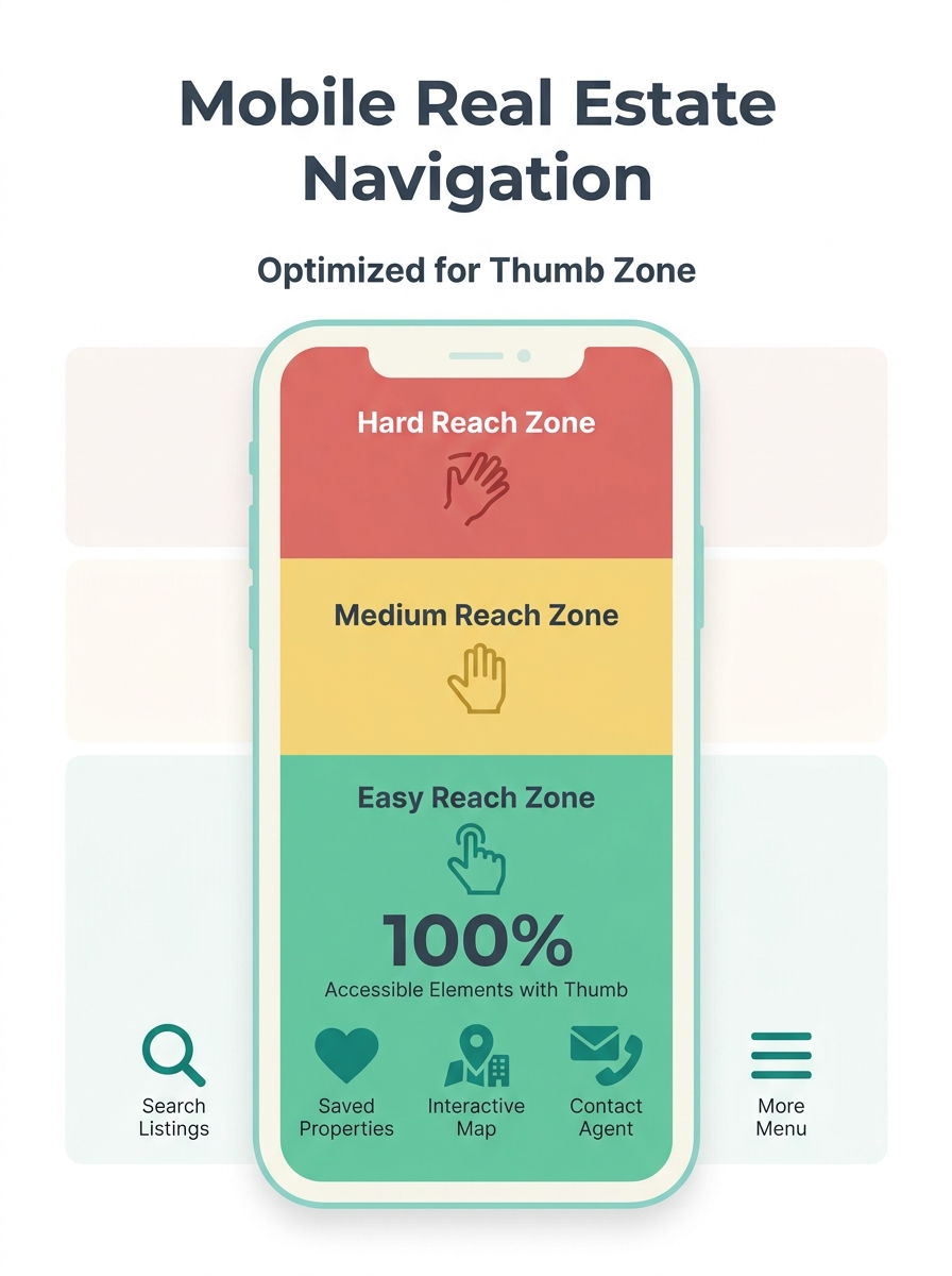
The single most misunderstood constraint in property search navigation design is physical: how a human hand holds a phone. The bottom third of the screen is the easiest area to reach with one thumb. The top corners are the hardest. Most desktop-converted real estate sites put their primary navigation in a hamburger menu at the top-left corner, exactly where thumbs can’t go without shifting grip.
Sticky bottom navigation bars solve this by placing 4–5 core actions (Search, Saved, Map, Contact, Menu) within the natural thumb arc. According to mobile navigation pattern research from UXPin, designers often hide the tab bar during content consumption and add interactions to bring it back, ensuring users get full-screen property images without losing access to navigation.
Touch targets matter at the pixel level. AgentFire’s design best practices research specifies that buttons and links should be at least 48×48 pixels to prevent accidental taps on mobile. Most agent website templates ship with 32×36 pixel buttons inherited from desktop designs. That 12-pixel gap translates directly into misclicks, frustration, and exits.
Limit your top-level navigation to 5 items or fewer. Every additional menu option on a phone screen increases cognitive load and decision time. Buy, Sell, Search, Communities, Contact covers the full range of visitor intent without requiring a second tap into submenus.
Intent Routing on the First Screen
A desktop homepage can afford to be broad because visitors have screen space to scan multiple sections simultaneously. On a phone, visitors see roughly 400 pixels of content before scrolling. Those 400 pixels need to route each visitor to the right path immediately.
The mechanism works through what I’ll call the Four-Layer Mobile Stack: Navigation → Search → Listing → Capture. Each layer addresses a specific stage of buyer behavior, and each has architectural requirements that differ from desktop.
The first layer, Navigation, routes by intent. A buyer tapping “Buy” sees neighborhood filters and price ranges. A seller tapping “Sell” sees a home valuation tool and recent sales data. If you’ve explored aspiration-first homepage design, you already know that mixing buyer, seller, and investor messaging on the same first screen dilutes all three conversion paths.
Scoped language accelerates this routing. Replace “Your Local Experts” with “Downtown Condos and Westside Single-Family Homes” so visitors self-qualify within 2 seconds. The probability of a visitor bouncing increases by 32% when page load time extends from 1 to 3 seconds, and cognitive load from vague messaging compounds that exit pressure.
The goal is zero wasted scrolls. If a buyer has to scroll past seller content to find search filters, you’ve introduced friction that costs you mobile lead capture optimization at the structural level.
How Property Search Works on a 6-Inch Screen
Property search is where the real estate site structure either earns or loses the visit. The search interface needs to accomplish on a 375-pixel-wide screen what portal apps accomplish with dedicated engineering teams.
Place a prominent search bar above the fold with location autocomplete, price range sliders, beds/baths steppers, and property type toggles. Display active filters as removable chips so visitors can adjust without re-opening a filter panel. The filter panel itself should slide up from the bottom of the screen (a bottom sheet pattern), keeping it within thumb reach rather than dropping down from the top.
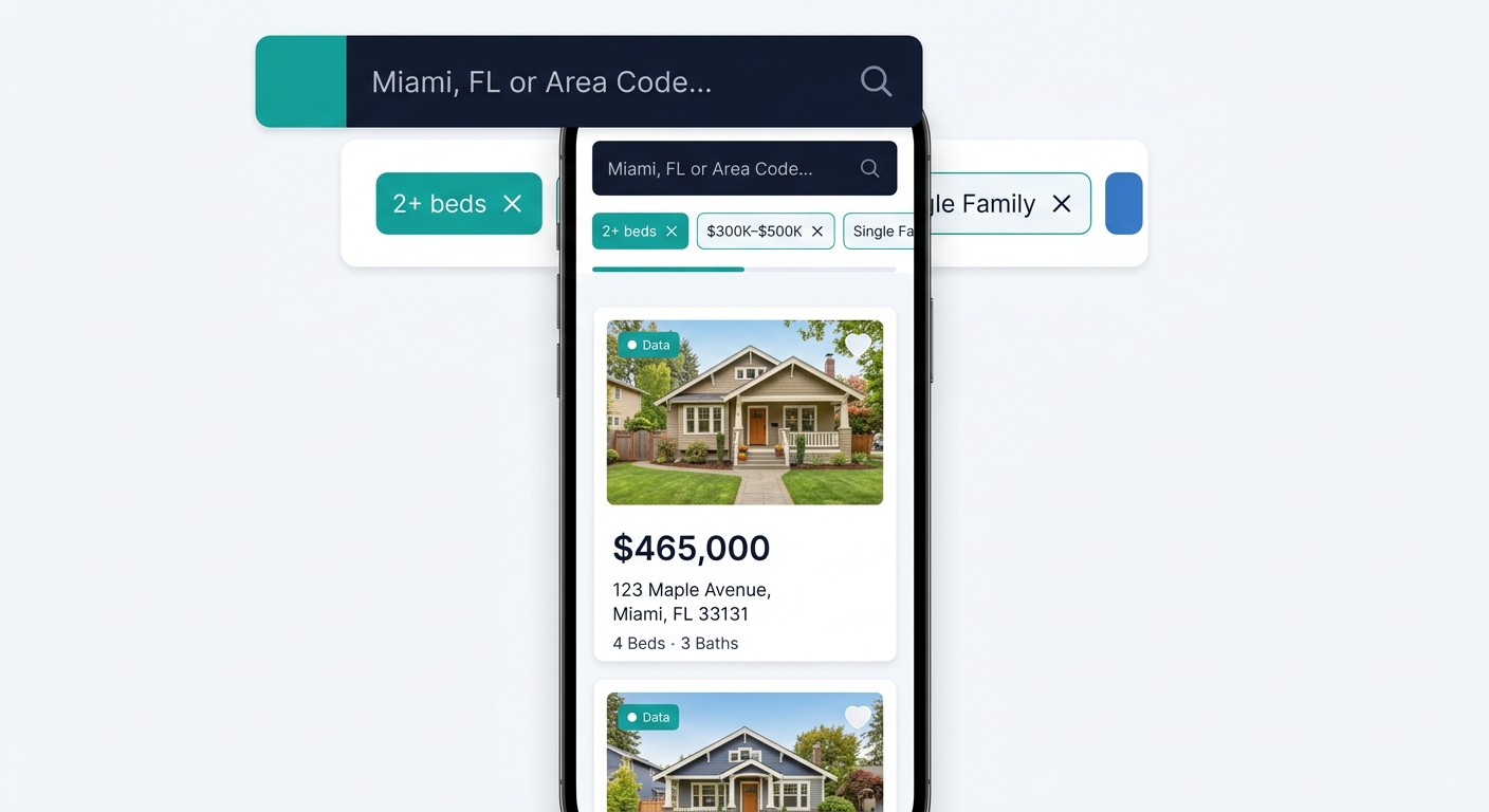
On desktop, the standard layout pairs a scrollable list with an adjacent map. On mobile, this becomes a toggle: list view or map view, with a floating button to switch between them. Stacking both vertically wastes screen space and forces excessive scrolling. Research from Uptech’s UX review of real estate apps confirms that geo-locational capabilities using GPS data to show properties within the user’s vicinity outperform keyword-based local search on mobile.
Individual listing pages function as landing pages on mobile. Two CTAs appear above the fold: “Schedule a Tour” and “Request Info.” Listings with video generate 403% more inquiries than those without, and 41% of buyers rank photos as the most useful listing feature. Both stats point to the same architectural requirement: images and video load first, descriptive text loads second. Users on mobile prefer image-rich content with minimal text, which means your data hierarchy should display price, beds, baths, and square footage at a glance while hiding HOA fees, year built, and tax history behind an expandable section.
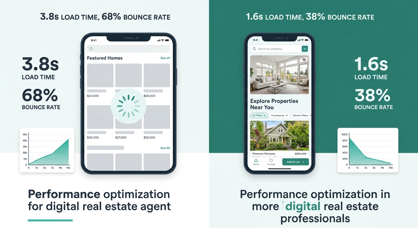
The gap between a “responsive” real estate site and a mobile-first one shows up most clearly on the listing page, where image load order, CTA placement, and data hierarchy either earn a lead or lose a visitor in under 4 seconds.
Lead Capture as an Architectural Layer
The typical agent website treats lead capture as a destination: a contact page, a pop-up modal, or a form buried at the bottom of a listing. Mobile-first architecture treats it as a persistent layer woven into every screen.
Mobile users account for over 73% of real estate searches, and they benefit from sticky “Inquire” buttons with large, tappable areas that follow them as they scroll through listing photos. This isn’t a UX preference. It’s a conversion mechanism. When the CTA disappears off-screen, the visitor has to remember to scroll back up and find it. Most don’t.
A two-step form structure balances volume and data quality. Step 1 captures intent, area focus, and timeline (3 fields maximum). Step 2, triggered after initial engagement, requests deeper qualification details. If you’ve read about how design choices create conversion bottlenecks, you know that 7-field forms on mobile kill completion rates. A 1% improvement in conversion rate, moving from 0.5% to 1.5%, means the difference between a slow quarter and a record one, according to lead conversion research.
Trust signals need architectural placement, too. Testimonials, response-time indicators, and transaction counts belong adjacent to CTAs, not quarantined on a separate “About” page. On mobile, where scrolling is the primary navigation mode, proof of competence must appear within the same scroll sequence as the action you’re asking visitors to take.
| Mobile Lead Capture Element | Placement | Minimum Size | Purpose |
|---|---|---|---|
| Sticky “Inquire” button | Bottom of screen, persistent | 48×48 px tap target | Capture intent from any scroll position |
| Two-step form (Step 1) | Triggered by CTA tap | 3 fields max | Reduce friction, capture basics |
| Phone/text button | Bottom nav bar | 48×48 px tap target | Direct contact for high-intent visitors |
| Social proof snippet | Adjacent to CTA | 1–2 lines | Reduce hesitation at decision point |
| Saved search prompt | After 3rd search | Inline banner | Build return visits and capture email |
Speed as a Structural Decision
Page speed on mobile is an architectural outcome, not a setting you toggle on. Every navigation choice, image format, and script you include determines whether your site loads in under 2 seconds on a 4G connection, the threshold where pages see a 30% higher conversion rate than slower counterparts.
Compress listing images to under 200KB each. Use lazy loading so photos below the fold don’t compete with above-the-fold content for bandwidth. Eliminate third-party scripts that aren’t directly tied to search or lead capture. Every chat widget, analytics pixel, and social embed adds weight. A detailed look at how Core Web Vitals affect your local rankings shows that organic search visitors convert at roughly 3.2%, more than double the 1.5% rate from paid traffic, which means speed-driven organic ranking losses hit harder than most agents realize.
Own your platform and domain. Propphy’s 2026 best practices analysis stresses that building on a platform you control (WordPress, Webflow, or a custom build) lets you make speed decisions that broker-provided subpages and template builders won’t allow. If your website performance has never been audited, the mobile speed problem is likely worse than you think. Broker templates routinely ship with 1.2MB hero images and unminified CSS files that push load times past 4 seconds on cellular connections.
Warning: A “responsive” site that loads in 1.8 seconds on desktop can easily take 4+ seconds on a phone over 4G. Test on real devices and real networks, not just Chrome DevTools with a wired connection.
Where the Four-Layer Model Breaks Down
This architecture assumes your visitors arrive with some intent already formed. That’s true for the majority of property search traffic, where someone types a neighborhood name or price range into Google. It’s less true for top-of-funnel social media traffic, where visitors land with curiosity but no specific search criteria.
For social-driven visitors, the Search layer of the Four-Layer Mobile Stack (Navigation → Search → Listing → Capture) isn’t the right entry point. These visitors need an editorial layer: neighborhood guides, market snapshots, lifestyle content that builds intent before funneling toward search. The mobile architecture described above doesn’t account for this content type well, because it prioritizes transactional efficiency over discovery browsing.
The model also assumes a baseline level of listing inventory. Agents with fewer than 20 active listings won’t fill a search interface convincingly. In that case, the search layer becomes a thin IDX feed that looks identical to every other agent site pulling from the same MLS, and the differentiation shifts entirely to the Navigation and Capture layers.
And the speed requirements are real constraints, not aspirational targets. If your brokerage locks you into a hosted platform where you can’t control image compression, script loading, or server response times, the architectural decisions described here are partially or entirely unavailable to you. Knowing the mechanism helps you evaluate what your current platform actually allows versus what it prevents, which is the first step toward deciding whether the platform itself needs to change.