

Real estate websites convert between 1% and 3% of visitors into leads, according to industry conversion data. The sites landing at 3% don’t win on visual polish — they win because their content structure matches the way buyers search for homes. That’s a navigation problem, not a color palette problem.
TL;DR: Beautiful real estate websites lose leads when visitors can’t find what they need within two clicks. Organizing your site around buyer search intent, neighborhood context, and listing data converts at multiples above the industry average. These seven rules explain how to restructure for results.
A clear website structure reduces bounces and increases pageview depth, while UX research shows well-designed information architecture can increase conversion rates by up to 200%. And 53% of mobile users abandon a site entirely when navigation confuses them or load times drag. The agents spending $3,000 on a homepage redesign while their listing pages sit three clicks deep are solving the wrong problem.
These seven rules for real estate website information architecture will help you build a conversion-focused website structure that turns traffic into showings.
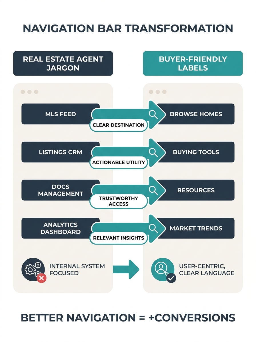
Label your navigation for buyers, not your brokerage org chart
The single fastest way to lose a visitor is forcing them to decode your internal terminology. “Residential Division” means nothing to a buyer searching for a three-bedroom in Westlake. “Homes for Sale” does. “Communities” is ambiguous — are those HOA communities, neighborhoods, or new developments? “Neighborhoods” is clear.
Audit your top navigation right now. Every label should answer one question: what would a first-time visitor to this site expect to find behind this link? If the answer requires knowledge of your brokerage’s internal structure, rename it.
According to UX best practices documented by Dcastalia, effective real estate sites prioritize easy navigation and clear calls to action above visual flourish. The research consistently points to the same conclusion: buyer-centric labels outperform branded ones because they reduce the cognitive work of figuring out where to click.
Cap top-level navigation at seven items
Cognitive load research (Miller’s Law, if you want the formal name) established decades ago that humans process about seven items in working memory at once. Your site navigation is no exception. When you cram 12 top-level links across the header — Home, Buy, Sell, Rent, Commercial, About, Team, Blog, Testimonials, Resources, Contact, Careers — you’re asking visitors to parse a wall of options before doing anything useful.
The fix: seven items maximum in your primary navigation. Everything else goes into a footer, a dropdown submenu, or gets cut entirely. If your “Careers” page gets 40 visits a month and your “Homes for Sale” page gets 4,000, they don’t deserve equal billing in your header. Prioritize ruthlessly. The agents who’ve already addressed their homepage search bar design understand this instinct — fewer choices at the top of the page means faster action from visitors.
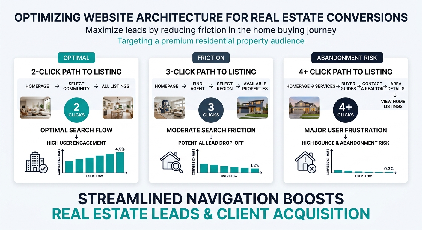
Make every listing reachable in two clicks from the homepage
This is what I call the Two-Click Architecture Test, and it’s the fastest diagnostic you can run on any real estate website. Pick any active listing your site hosts. Starting from the homepage, count how many clicks it takes to reach that listing’s detail page. If the answer is more than two, your site has an architecture problem that no amount of design polish will fix.
The path should look like this: Homepage → Search/Filter Page → Individual Listing. That’s two clicks. When you add an intermediate “choose your region” page, or force users through a “browse by property type” gateway before they can even access search filters, you’re adding friction at the exact moment a motivated buyer is ready to engage.
Tip: Run the Two-Click Architecture Test on your own site right now. Open an incognito browser, go to your homepage, and try to reach five different listings. If any of them require three or more clicks, you’ve identified exactly where your buyer journey navigation design breaks down.
This directly impacts conversion. Real estate guide publisher Uprealer notes that a few structural tweaks to site navigation can double a site’s conversion rate. The two-click threshold is the most reliable of those tweaks because it maps to how buyers actually behave: they want to search, filter, and see results. Every extra click between them and a listing is a point where they leave for Zillow instead.
Structure listing pages around buyer questions, not MLS field dumps
Your MLS feed spits out data in a specific order: MLS number, list price, status, property type, square footage, bedrooms, bathrooms, year built, lot size, tax information. That order makes sense for agents comparing comps. It makes zero sense for a buyer trying to figure out whether this house works for their family.
Buyers arrive at a listing page with a mental checklist that looks something like: Can I afford it? (Price, taxes, estimated payment.) Does it fit? (Bedrooms, bathrooms, square footage.) Where is it? (Neighborhood, school district, commute time.) What does it look like? (Photos, virtual tour.) What do I do next? (Schedule a showing, ask a question.)
Organize your listing pages in that order. Price and key specs at the top. Location context and neighborhood data in the middle. Photos and tours integrated throughout. And a clear contact CTA visible without scrolling — something we’ve covered in depth when analyzing how CTA button placement affects agent conversion rates.
Propphy’s analysis of top real estate websites reinforces this: the best-performing commercial property sites emphasize clarity, filters, and presentation of core data (size, use, location, availability) with clean UI. Residential sites that follow the same principle — leading with what buyers actually want to know — consistently outperform those that dump raw MLS data onto the page.
Place a visible CTA on every page, not just landing pages
A buyer reading your neighborhood guide for Midtown is showing intent. A seller scanning your market report for Q1 price trends is evaluating whether to hire you. Neither of these visitors will navigate back to your homepage to find your contact form. If there’s no CTA on the page they’re reading right now, you’ve lost them.
Every page on your site — every listing, every blog post, every neighborhood guide, every “About the Team” bio — needs at least one clear call to action. That doesn’t mean plastering “CONTACT US” buttons everywhere. It means matching the CTA to the page context. A listing page gets “Schedule a Showing.” A neighborhood guide gets “See Homes in This Area.” A market report gets “Get Your Home’s Current Value.”
If there’s no CTA on the page a buyer is reading right now, you’ve lost them. Every page needs an action that matches its context.
The visitors who arrive on deep pages through organic search — and this is increasingly common as Google’s organic results shift below AI Overviews — will never see your homepage. Your property listing organization UX needs to account for entry points across every page, not just the front door.
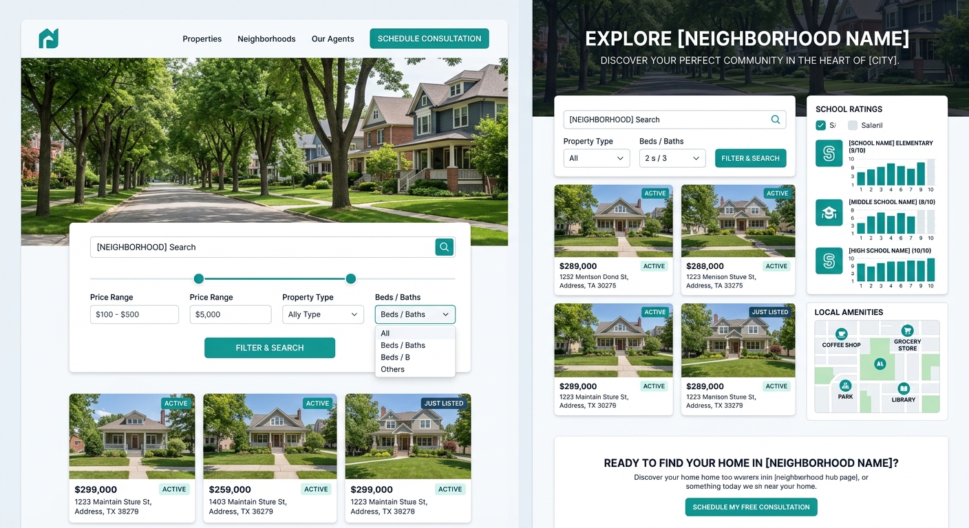
Build neighborhood pages as navigation hubs, not blog posts
Neighborhood content is one of the highest-value assets on a real estate website, but most agents bury it in their blog where it sits alongside market updates and holiday greetings. That’s a structural mistake. Neighborhood pages should function as navigation nodes — connective tissue between your homepage and your listings.
A properly structured neighborhood hub includes: a brief area overview, embedded listing search filtered to that neighborhood, school information, local amenities, and recent market stats. This page becomes a landing point for organic search traffic (buyers googling “homes for sale in Silverlake” or “best neighborhoods in Austin”) and a natural waypoint in the buyer journey navigation design of your site.
Building your site with IDX integration that connects directly to MLS data makes this feasible because the listing search on each neighborhood page updates automatically. Without that connection, neighborhood pages become static content that goes stale within weeks.
Test your structure before you test your colors
Card sorting and tree testing are standard UX research methods, and they cost almost nothing to run. Card sorting: write each page of your site on an index card, hand the stack to five people who match your buyer profile, and ask them to organize the cards into groups that make sense to them. Tree testing: show those same people your proposed navigation structure (text only, no design) and ask them to find specific information.
If three out of five testers can’t find “homes for sale in [neighborhood]” within 30 seconds using your navigation tree, your structure is broken. No amount of beautiful photography or brand-aligned color palettes will compensate. Fix the architecture first.
As one New York-based web design firm working specifically in real estate put it, they build sites “from the ground up, with clear information architecture, entity-driven content.” That sequencing matters — architecture first, entity and content structure second, visual design third.
When These Rules Conflict With Each Other
These rules will occasionally pull in opposite directions. Capping navigation at seven items can make the two-click test harder to pass if you serve a large geographic area with dozens of neighborhoods. Building neighborhood hubs as navigation nodes adds structural complexity that can bloat your sitemap. Placing CTAs on every page can feel cluttered on content-heavy market reports.
When you hit these tensions, default to the buyer’s perspective. Run the two-click test from their entry point (which is increasingly a deep page from search, not your homepage). Ask whether the navigation label would make sense to someone who has never heard of your brokerage. Check whether the CTA matches the intent of the page it’s sitting on.
Santa Barbara brokerage Village Properties, profiled by HousingWire, demonstrates what happens when design serves architecture well. Their site uses subtle color cues reflecting the Spanish revival style their buyers want — but those visual choices reinforce the structure rather than replacing it. The design tells you where you are in the site. The architecture tells you where to go next. Those are different jobs, and the best real estate websites treat them that way.
Your site’s conversion rate sits somewhere in that 1% to 3% band. Moving from the bottom to the top of that range rarely requires a visual redesign. It requires looking at your site’s bones — the labels, the depth, the paths between pages — and rebuilding them around the way your buyers actually think.