
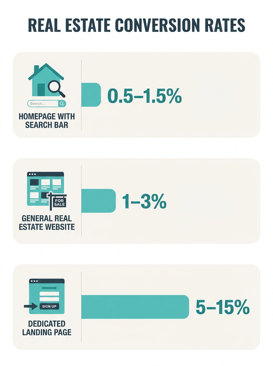
The conversion rate gap between a dedicated real estate landing page and a standard agent homepage runs roughly 10x: landing pages convert at 5% to 15%, while the typical homepage built around a prominent property search bar pulls 0.5% to 1.5%, according to industry data compiled by Contempo Themes.
TL;DR: The dominant search-bar-first homepage layout actively suppresses lead conversion by training visitors to browse anonymously. Replacing or restructuring the search bar with intent-matched content layers and strategically placed CTAs can push homepage conversion rates from under 2% toward the 4% to 5% range documented in redesign case studies.
The Conversion Numbers That Expose the Search Bar Problem
Why does the standard real estate homepage underperform so badly? Because most agent sites are built around a single element: a wide, prominent MLS-connected search bar, positioned dead center above the fold. The design logic seems sound. Ninety-three percent of homebuyers search online, so give them search. But the average real estate website converts at just 1% to 3% according to SEO Real Estate Wagon, and homepages that rely on the search bar as their primary feature consistently land at the bottom of that range.
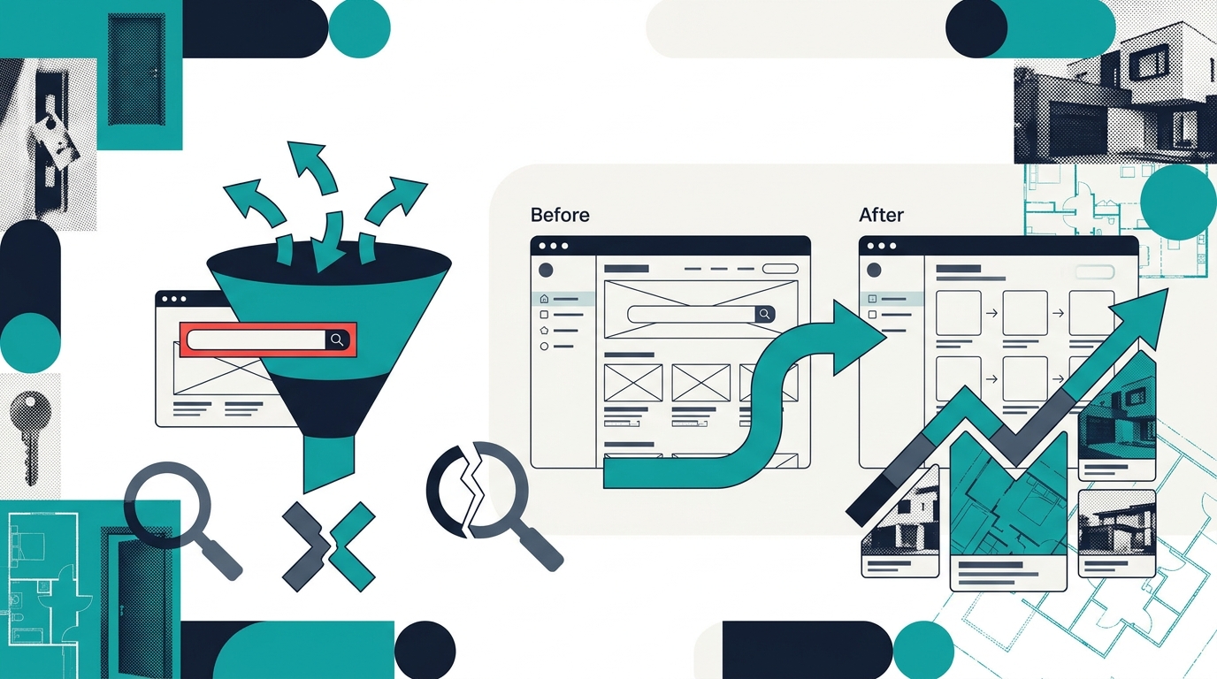
The problem is behavioral, not aesthetic. When a visitor lands on your homepage and immediately starts searching listings, they enter a self-service browsing mode. They scroll through results, click a few photos, maybe save a mental bookmark, and leave. No form fill. No email captured. No phone number exchanged. The search bar gives them exactly what they came for without ever requiring them to identify themselves.
Compare that to dedicated landing pages, which convert between 5% and 15% by stripping away everything except a single offer and a single form. The difference between 1% and 10% conversion on 500 monthly visitors is the difference between 5 leads and 50.
Three UX Anti-Patterns Hidden in the Search-First Layout
The search bar itself isn’t the enemy. The anti-pattern is building your entire homepage around it. Three specific design failures tend to travel together on search-bar-dominant homepages, and each one compounds the conversion leak.
Anti-pattern 1: The anonymous browsing loop. Your IDX integration serves thousands of listings directly on your site, which is excellent for keeping visitors off Zillow. But when the search bar is the first and most prominent interactive element, visitors can spend 10 minutes browsing without encountering a single reason to share their contact information. Soft lead-capture tools like new listing alerts, saved search notifications, and market report opt-ins need to appear before or alongside the search experience, not buried three clicks deep. Design Monks’ UX research recommends including these soft tools with short, simple forms to reduce friction while still generating identifiable leads.
Anti-pattern 2: CTA burial. A W3Squad case study documented that a strategic real estate website redesign increased serious property inquiries by 1.8x and property interactions by 31% after restructuring the layout to surface calls-to-action earlier and more frequently. The search bar, by occupying the visual center of the page, physically pushes CTAs below the fold or into sidebars where they’re ignored. If you’ve audited your own site’s CTA button placement, you’ve probably found the same pattern: the most valuable conversion points are hiding behind the search interface.
Anti-pattern 3: No intent differentiation. A buyer searching for “3-bed homes in Lakewood under $400K” has different intent than someone looking for “what’s my home worth” or “best schools in Lakewood.” The standard search bar treats all visitors identically as property searchers. It ignores sellers, ignores renters, ignores people in early research mode who need neighborhood guides and market data more than they need listing thumbnails. Sierra Interactive’s lead generation research emphasizes the importance of showcasing neighborhood knowledge alongside property listings, including local business info, restaurant guides, and blog content that gives visitors reasons to return and eventually convert.
The Intent-Layer Stack: A Redesign Framework
A high-converting real estate homepage design strategy replaces the search-bar monolith with what I call the Intent-Layer Stack: three distinct content zones that match different visitor motivations and capture leads at each level. Score your own property search bar conversion optimization efforts against this structure.
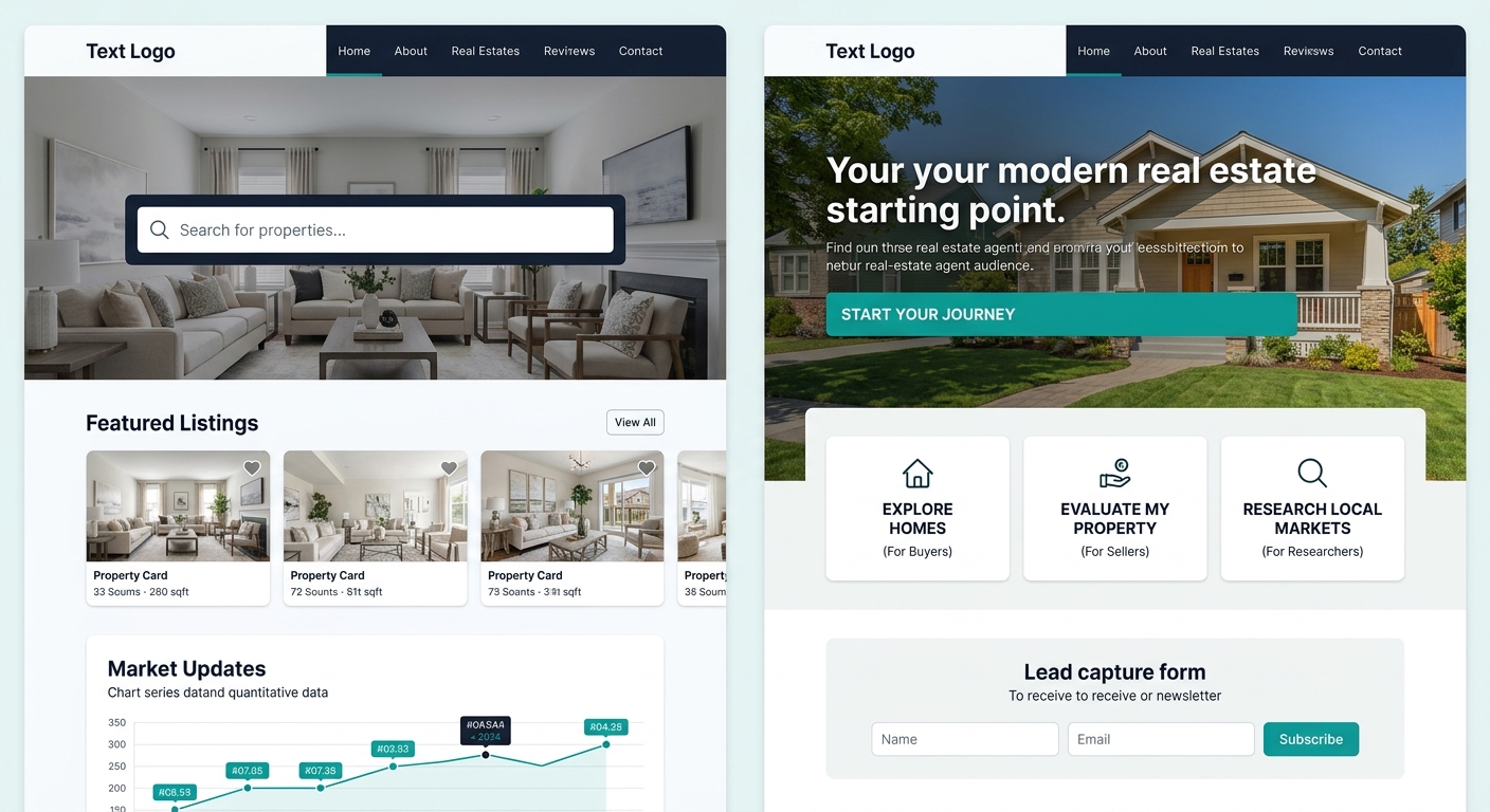
Layer 1: The value headline and primary CTA (above the fold). Instead of a search bar, the top of your page states your specific value proposition paired with a single, clear CTA button. MarketingSherpa documented a case where adding a prominent sticky CTA to a real estate website pushed conversion rates to 4.5%, roughly 3x the typical homepage rate, without any other design changes. The CTA does the conversion work. The headline earns the click.
Layer 2: Intent-segmented pathways (mid-page). Below the primary CTA, offer 3 to 4 clear pathways: “Search Homes for Sale,” “Get Your Home’s Value,” “Explore Neighborhoods,” and “Talk to an Agent.” Each pathway routes to a purpose-built page with its own lead capture mechanism. This is where the search bar lives, as one option among several rather than the default experience. Agents already grappling with the feature bloat problem in their website builders can often accomplish this segmentation with existing tools by reorganizing rather than adding features.
Layer 3: Social proof and local authority (below the fold). Testimonials, recent sales data, neighborhood guides, and blog content teasers. This section serves two audiences: visitors who scroll past the CTAs because they’re not ready to commit, and search engines looking for content signals. Building out hyperlocal neighborhood content at this layer gives your homepage depth that a search bar alone can never provide.
The search bar gives visitors exactly what they came for without ever requiring them to identify themselves. That’s the conversion leak most agents never diagnose.
How the Two Layouts Compare on Key Metrics
The table below maps the specific real estate UX anti-patterns in a search-bar-dominant layout against the Intent-Layer Stack across five measurable criteria.
| Criteria | Search-Bar-Dominant Homepage | Intent-Layer Homepage |
|---|---|---|
| First interactive element | Property search bar (anonymous) | Value proposition + CTA (identity capture) |
| Visitor segmentation | None, all visitors get the same search | 3-4 pathways matched to buyer, seller, researcher intent |
| CTA visibility above the fold | 0-1 CTAs, often obscured by search UI | 1 primary CTA with sticky reinforcement |
| Soft lead capture tools | Buried behind search results or absent | Integrated alongside content: alerts, saved searches, reports |
| Conversion rate benchmark | 0.5%-1.5% | 3%-5% with sticky CTA and intent paths |
The conversion delta between these two layouts compounds dramatically with traffic. An agent running local SEO strategies that bring in 1,000 monthly homepage visitors will generate roughly 10 leads per month with a search-bar-dominant layout at 1% conversion. The same traffic hitting an intent-layered homepage at 4% produces 40 leads, a 4x increase with zero additional ad spend.
And the mobile dimension makes this gap even wider. With more than 70% of real estate searches happening on smartphones and 53% of users abandoning sites that take longer than 3 seconds to load, a search bar with complex filter dropdowns creates a particularly hostile mobile experience. The property search filters need to be built for touch-first interaction, but they shouldn’t be the first thing a mobile visitor encounters. A high-converting real estate website layout on mobile puts the CTA button where a thumb can reach it, and saves the full search interface for a dedicated interior page.
Tip: Before rebuilding your entire homepage, test the simplest version of this framework: add a sticky CTA bar to your existing site. The MarketingSherpa data showed a 4.5% conversion rate from this single change alone, giving you a baseline to measure further redesign efforts against.
What the Conversion Data Doesn’t Capture
The numbers in this analysis tell a clear directional story: search-bar-dominant homepages convert worse than intent-segmented layouts with prominent CTAs. The 10x gap between homepage and landing page conversion rates is well-documented across multiple sources. The 4.5% sticky CTA benchmark, the 1.8x inquiry increase from W3Squad’s redesign, and the 31% lift in property interactions all point the same direction.
But the data has gaps worth acknowledging. Conversion rate benchmarks rarely account for lead quality. A homepage converting at 4.5% might produce lower-intent leads than one converting at 1.5% if the higher-converting design captures people who aren’t genuinely ready to transact. The relationship between your website design choices and downstream lead quality is something conversion rate alone can’t measure. You need to track cost-per-closed-deal across your pipeline, not cost-per-form-fill.
The data also can’t tell you which intent-layer configuration works best for your specific market. An agent in a seller’s market where inventory moves in 48 hours has different homepage needs than one in a buyer’s market where education and patience drive the sale. The Intent-Layer Stack gives you a starting structure, but agents building with platforms like Pillar property websites should test their own variations and measure against their own pipeline rather than relying on industry averages alone. The 61% of visitors who won’t return to a poorly optimized site are giving you one shot. Whether you spend that shot on an anonymous search bar or an intent-matched CTA is the design decision that determines whether your homepage generates leads or merely displays listings.