
Property pages built in the default template order—hero image, full description, room-by-room specs, then a contact form at the bottom—lose the majority of potential leads before visitors scroll far enough to convert. The fix is structural: rearranging what appears where on the page and embedding conversion points within the content buyers actually consume.
TL;DR: The default property page stacks all listing details above the contact form, which means most visitors leave before reaching it. Restructuring detail placement around a three-zone hierarchy—above-fold CTA, mid-scroll proof, deep-scroll detail—can increase lead capture rates by 27-40% based on current conversion benchmarks.
The Default Template Problem
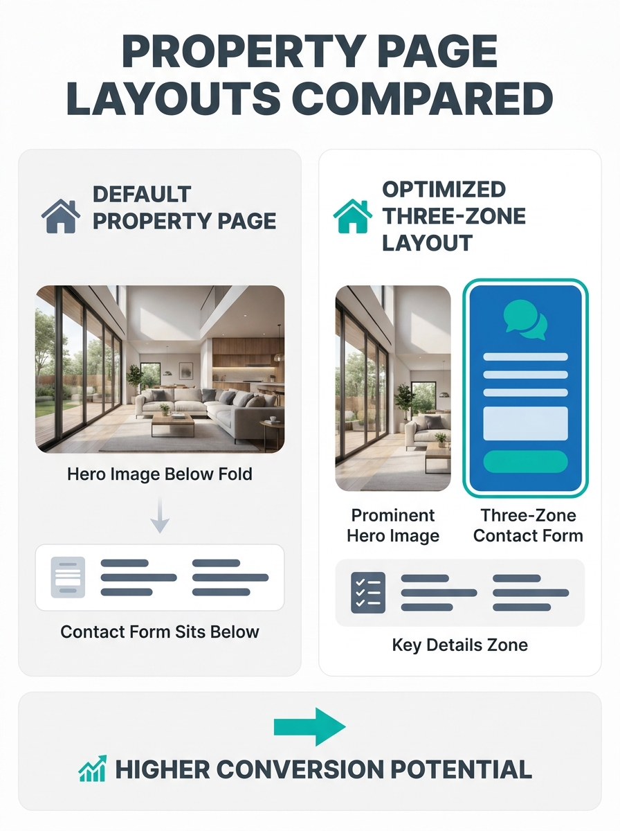
Every major IDX platform and real estate website builder ships property pages with the same sequence: full-width hero photo, followed by a text-heavy description block, followed by a specification grid (beds, baths, square footage, lot size, year built), followed—finally—by a contact form or “Schedule a Showing” button sitting below 1,500+ pixels of content.
Pages featuring interactive elements like maps see a 27% increase in views and a 40% boost in conversion rates, according to landing page best practices research from Landingi. But those interactive elements rarely appear above the fold on default property pages. They’re buried in the basement of the page alongside the contact form, where over 60% of mobile visitors never scroll.
The result: your property page functions as a beautiful informational dead end. The visitor sees the photos, skims the description, gets the information they wanted, and leaves without providing a name, email, or phone number.
This pattern mirrors the broader structural problems that cost agents leads throughout their entire website architecture. But the property page is where the damage concentrates, because it’s where buyer intent peaks. Someone clicking into a specific listing has already expressed interest. The page’s job is to convert that interest into a conversation, and the default layout fails at that job systematically.
Above-the-Fold Placement Changes Everything
Dark backgrounds reduce visual competition and make product imagery pop, according to analysis of 20 high-converting above-the-fold designs from Popupsmart. The same principle applies to property pages: when the CTA sits within the hero section—overlaid on or immediately adjacent to the lead photo—it benefits from the visual dominance of the image itself.
A 2026 Unicorn Platform analysis of real estate lead-capture pages found that form strategy must balance conversion accessibility and lead quality. Short forms increase submissions, but overly shallow intake overloads follow-up with low-fit demand. The recommended approach uses a two-step form: the first step captures essential routing and intent (name, email, “Are you pre-approved?”), while the second step collects deeper qualification details after initial fit is established.
Applied to the property page, this means your above-the-fold area should contain a compact, 2-3 field lead capture element rather than a full inquiry form. Think “Get Private Showing Details” with name and email, rather than a 7-field contact form. The full contact form can live further down the page for visitors who want to provide more context, but the lightweight capture point needs to sit where the eye lands first.
For agents working on mobile-first property search architecture, this is especially critical. Over 60% of real estate traffic arrives on mobile devices, where “below the fold” means below the thumb’s reach on a 6.1-inch screen. A contact form that sits 1,800 pixels down a desktop page sits 3,600+ pixels down on mobile. The scroll distance alone kills conversion.
Agents Front-Load the Wrong Information
The conventional wisdom in real estate detail organization says: give the buyer everything. Room dimensions, HOA fees, tax history, appliance details, neighborhood stats, school ratings, walk score, transit score, noise score. Stack it all onto the property page and let the buyer self-serve.
This approach treats information as uniformly valuable. It isn’t. Buyers search for specific features in a predictable priority order, and the details that generate emotional engagement differ sharply from the details that satisfy analytical due diligence. The property details hierarchy research on this site established that buyers search photos first, then price, then location, then bed/bath count—and only after those four do they dig into square footage, lot size, year built, and other specifications.
The implication for listing detail placement conversion is clear: the top of your property page should mirror this buyer priority stack. Hero gallery and price above the fold. Location context (neighborhood name, proximity to landmarks) immediately below. Bed/bath/parking headline stats as a compact row, not a sprawling grid. And then, before the full description, before the room-by-room breakdown, before the tax history, a lead capture element.
If 60%+ of your visitors never scroll past the property description, and your only conversion mechanism lives below the property specs, you’ve built a page that informs without converting.
Key elements of effective landing pages in the real estate sector include a well-thought-out headline, attractive visuals, a highlighted CTA, and a detailed offer description with contact elements, according to Landingi’s best practices research. The word “highlighted” matters here. A CTA buried below 2,000 pixels of room-by-room specification text is hidden, not highlighted.
For luxury property page design specifically, this hierarchy becomes even more important. Luxury buyers aren’t comparison-shopping on specs the way a first-time buyer cross-references school districts. They respond to visual storytelling, lifestyle positioning, and exclusivity signals. A luxury listing page that opens with a 300-word description of cabinet hardware before showing the ocean view or the private dock has its hierarchy inverted. The wellness home showcase approach demonstrates how lifestyle-led content outperforms spec-led content for high-end properties.
Mobile Traffic Compounds Every Mistake
Desktop property page layouts already bury lead capture too deep. Mobile makes it worse by a factor of 2-3x in scroll distance, and mobile accounts for the majority of property page views. UX research from RevivalPixel confirms that images need to be optimized with lazy loading, caching, and performance testing because users link speed to professionalism and reliability. A property page that loads slowly on mobile doesn’t just lose impatient visitors—it signals to the remaining visitors that the agent isn’t detail-oriented.
The property page layout hierarchy that works on desktop collapses on mobile screens. A three-column spec grid becomes a single column that stretches 900+ pixels. A photo gallery displaying 6 images in a grid becomes a vertical stack that pushes everything below it another 2,400 pixels down. The contact form that sat “just below the fold” on a 1440px monitor now sits behind 4+ thumb-scrolls of content.
Unicorn Platform’s property management conversion research found that desktop polish is not enough when local-intent traffic evaluates pages on phones. Scope ambiguity creates low-fit leads and post-inquiry friction. Property pages should define what is included, what is optional, and where boundaries exist. This applies to page structure as much as service descriptions: each zone of the page needs a defined purpose, and mobile layouts need to respect those zones independently rather than simply stacking the desktop layout vertically.
Tip: Test your property pages on your own phone before touching the desktop layout. Load a listing, count thumb-scrolls to the contact form. If it’s more than 2, your above-the-fold lead capture strategy needs restructuring.
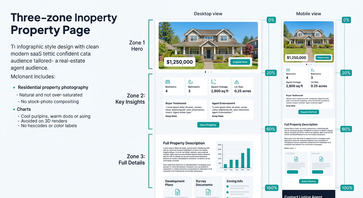
The fix for mobile involves what I call the Three-Zone Detail Hierarchy:
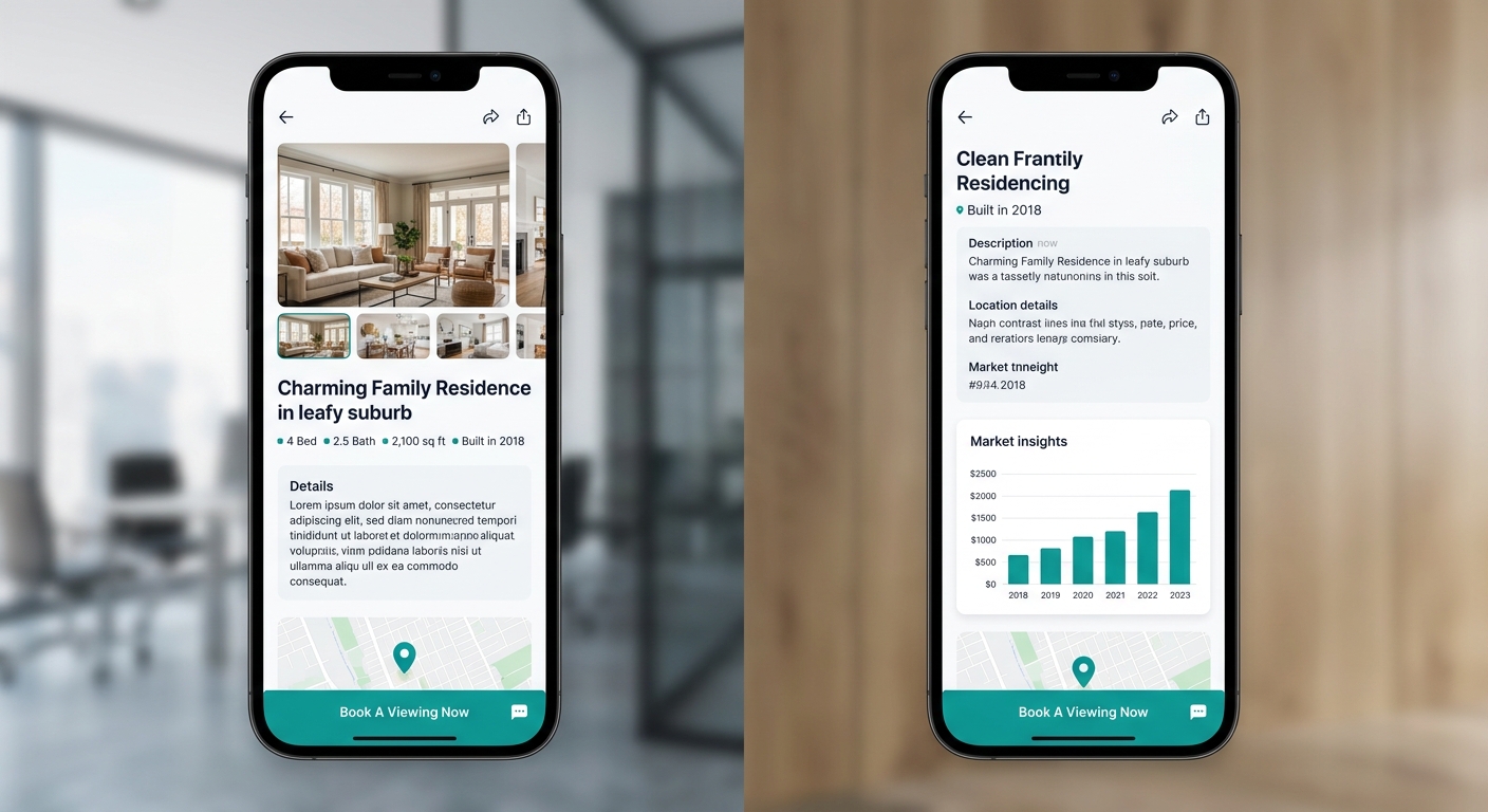
Zone 1 (above the fold, 0-600px on mobile): Hero image or compact gallery (3 images max), price, address, bed/bath/sqft headline row, and a sticky or inline CTA button (“Request Private Details” or “Schedule Showing”). This zone’s entire job is emotional hook plus conversion opportunity.
Zone 2 (mid-scroll, 600-1800px on mobile): Property description (150 words max), key amenity highlights, neighborhood context, and one piece of social proof—a testimonial snippet or a “12 buyers viewed this week” counter. This zone builds confidence and justifies the inquiry. We’ve covered where testimonials actually convert on real estate pages, and mid-scroll placement outperforms both hero-adjacent and footer-adjacent positioning.
Zone 3 (deep scroll, 1800px+ on mobile): Full specification grid, tax history, HOA details, school and transit scores, disclosures, and a full contact form with additional fields. This zone serves analytical buyers doing due diligence. They’ve already decided they’re interested enough to dig deep, and they’re more likely to fill out a longer form at this stage.
| Zone | Scroll Depth (Mobile) | Content | CTA Type | Primary Goal |
|---|---|---|---|---|
| Zone 1 | 0-600px | Hero photo, price, address, bed/bath/sqft | Compact 2-field form or sticky button | Capture impulse inquiries |
| Zone 2 | 600-1800px | Short description, amenity highlights, social proof | Secondary “Request Info” button | Build confidence, convert engaged browsers |
| Zone 3 | 1800px+ | Full specs, tax history, HOA, disclosures | Full contact form with qualification fields | Convert analytical buyers doing due diligence |
The Claim, Revisited
The default property page layout that ships with every real estate website builder suppresses the very behavior agents need most: visitor-to-lead conversion. The evidence runs in three channels. Above-the-fold CTA placement produces measurably higher conversion rates, with interactive elements driving a 40% conversion boost when properly positioned. The conventional spec-heavy information hierarchy puts the wrong content in the most valuable page positions, prioritizing analytical data over the emotional hooks that match how buyers actually browse. And mobile traffic—accounting for 60%+ of real estate browsing—amplifies both problems by stretching scroll distances beyond what most visitors will tolerate.
The Three-Zone Detail Hierarchy doesn’t require a rebuild. You’re using the same content you already have—the photos, the description, the specs, the contact form—but placing each element where it matches the buyer’s decision stage rather than where the template decided to stack it. Agents who’ve already audited their lead magnet placement and form architecture understand that where a form sits matters as much as what the form asks.
Rearranging your property page takes an afternoon. Measuring the difference takes a month of traffic data. But the structural logic holds: if your only conversion mechanism lives below the content where most visitors stop scrolling, you’ve built a page that educates buyers and then sends them to the next listing—or to an agent whose page was structured to capture them first. The template order was designed for information display. Your property page needs to be designed for conversion, and those two goals produce very different hierarchies.