

Unbounce’s conversion benchmark data puts the median landing page conversion rate across industries at 4.3%, with the top 25% of pages clearing 5.3%. The average real estate lead generation form converts at 2–5%, and buried form placement is the primary reason agents sit below even that floor.
TL;DR: Real estate website builders default to footer-only form placement, costing agents 40-60% of potential submissions. Fixing form position, reducing field count to 2 fields, and matching each lead magnet to visitor intent can push conversion rates above the 5.3% top-quartile benchmark.
The Default Placement Problem
Website builders optimize templates for aesthetics, not for lead magnet placement strategy. The standard real estate template puts a property search bar above the fold and buries the actual lead capture form in the footer, a sidebar, or a standalone “Contact Us” page requiring 2-3 clicks. According to Unbounce benchmark data cited by Luxury Presence, well-designed real estate landing pages with specific lead magnets and clear headlines routinely exceed the 4.3% industry median. The gap between that ceiling and the 2-5% average shows exactly how much bad placement costs.
The typical builder template arranges content in this order: hero image, property listings grid, agent bio, testimonials, footer with contact form. That structure treats lead capture as decoration, something visitors encounter only after scrolling past everything else. PropertyWebmasters’ analysis of common conversion failures identified 5 recurring problems: unclear calls to action, lengthy forms, poor mobile experience, slow loading times, and missing trust signals. Four of those five are placement and design problems that builders bake into default templates.
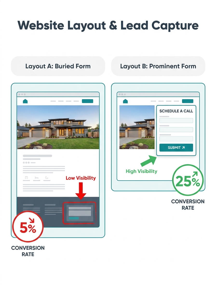
Three Builder Defaults That Bury Your Forms
Website builder lead capture design follows a pattern that prizes visual consistency over conversion mechanics. The form matches the site’s color palette and typography. But it sits where fewer than 15% of visitors will ever see it, because most users don’t scroll past the first 40% of a homepage.
Single-form architecture. Templates include one contact form for the entire site. A buyer browsing a $450,000 listing and a seller researching home valuations encounter the same generic “Get in Touch” box. REVA Global’s lead generation analysis found that forms asking only for a name and email “generate large volumes of responses but provide little insight into the lead’s situation or intent.” One form for all visitors means zero segmentation at the point of capture.
Footer-only placement. The contact form lives at the bottom of every page. On mobile devices, where more than 60% of real estate traffic originates, the footer can be 8-10 thumb-scrolls from the hero section. Agents who understand how page speed affects lead loss already know that every extra second of loading costs conversions. Extra scrolling has the same compounding effect.
No contextual triggers. A neighborhood guide page, a single listing page, and the homepage all serve the same form in the same location. The visitor who wants a market report and the visitor ready to schedule a showing see identical capture experiences. The trade-off between builder speed, design flexibility, and lead cost makes this predictable. Builders that launch fast tend to ship rigid templates with form placement locked in place.
What a Working Landing Page Architecture for Agents Looks Like
High-converting sites put the right lead magnet in front of the right visitor at the right scroll depth. Different pages need different forms, each tied to a specific offer.
| Page Type | Lead Magnet Offer | Placement | Expected Conversion Range |
|---|---|---|---|
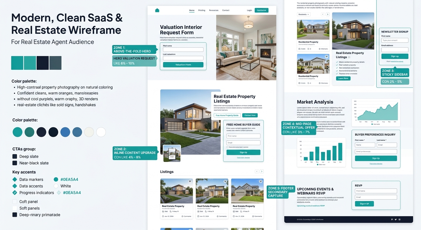
| Homepage | Free home valuation tool | Above the fold, right column | 3.5-5.5% |
| Neighborhood guide | Local market report PDF | Inline after 2nd section | 4.0-6.2% |
| Single listing page | Schedule a showing form | Sticky sidebar or floating CTA | 5.0-8.0% |
| Blog/content page | Buyer checklist or seller timeline | Content upgrade, mid-article | 2.5-4.8% |
| Seller landing page | Comparable sales analysis | Full-width form section | 4.5-7.0% |
PhotoUp’s analysis of agent lead generation tactics calls the free home valuation tool “one of the most effective lead magnets for real estate agents.” Placing it above the fold on the homepage, instead of in a submenu, can shift conversion from the 2% floor to the 5%+ range.
Tip: Build a separate landing page for each lead magnet. A dedicated page with a compelling headline, 2-3 value bullets, and a 2-field form (name and email) outperforms a generic contact page by 40-60% on conversion rate, according to conversion benchmark data across industries.
The Friction Tax on Every Extra Form Field
Every field you add costs submissions. CloudConics’ guide to real estate conversion describes the principle in three words: “Clarity equals conversions.” Short, visually appealing forms with essential fields only produce measurably higher submission rates than forms requesting budget, timeline, property type, and mortgage status upfront.
Real estate form conversion optimization starts with asking what information you actually need at first contact. A name and email address give you enough to begin a nurturing sequence. A phone number field, marked optional, lets motivated leads self-select. Everything else belongs in a follow-up email or a second-stage qualification form.
The data on lead magnet delivery emails supports this staged approach. Delivery emails for lead magnets see 55-70% open rates and 20-40% click-through rates, dramatically higher than standard marketing email benchmarks of 20-25% open rates. Your second email, sent 24-48 hours later, is where qualifying questions belong. Agents who overdeliver value in that initial delivery (bonus checklists, local pricing data, insider tips) have seen lead volume increase by up to 85%, according to Luxury Presence’s analysis of lead magnet performance.
Qualifying questions belong in your follow-up sequence, not your first-touch form. Lead magnet delivery emails hit 55-70% open rates, giving you a far better venue for deeper questions.
Gated vs. Partially Visible Content
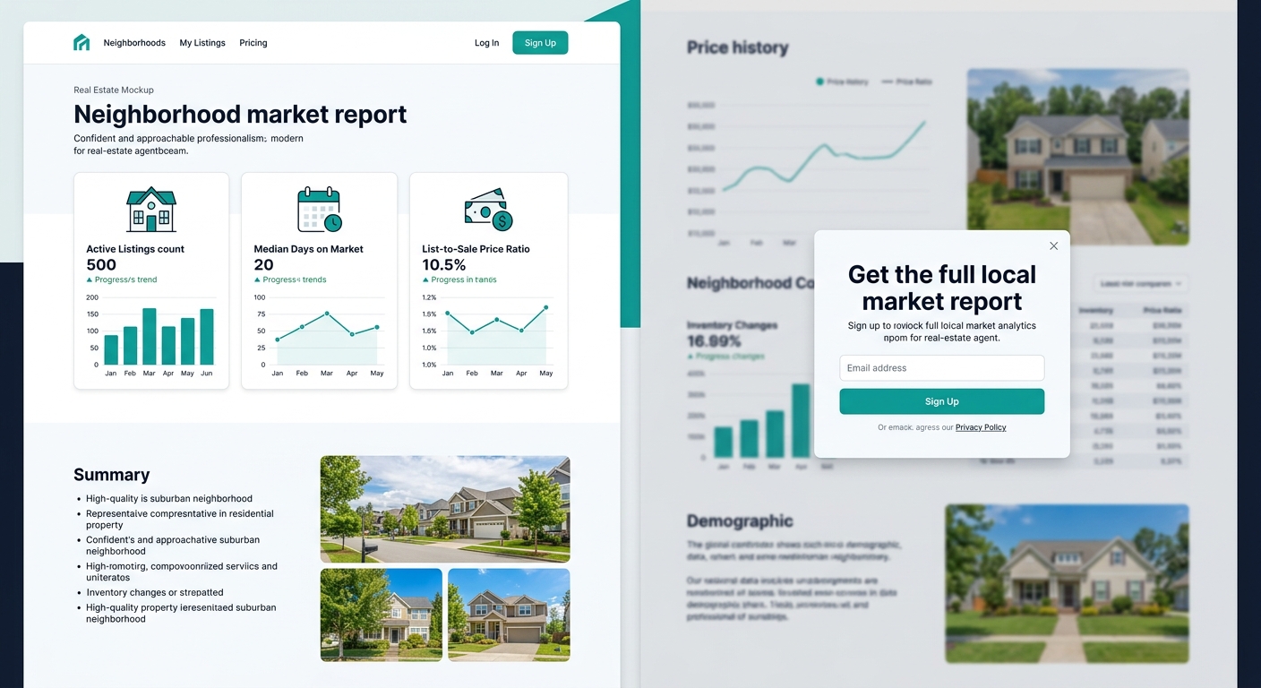
Perspective AI’s 2026 research on real estate lead generation surfaced a finding that challenges standard lead magnet assumptions: “putting your best content behind a form wall depresses capture.” Market reports, home valuations, and neighborhood data perform better when they’re partially visible, with the full version requiring an email address.
The distinction shapes how you structure your site architecture around buyer intent. A neighborhood guide showing 3 of 10 data points publicly, then gating the remaining 7 behind an email form, outperforms both extremes. A fully gated version triggers immediate bounces. A fully open version captures zero contact information. The partial-gate approach threads the needle between visibility and capture.
Your website builder needs to support conditional content display for this to work. If yours doesn’t, the workaround is embedding a form inline at the natural break point between free and gated sections. Agents building single property websites on Pillar get inline form placement controls that most template builders restrict to premium tiers.
Tracking Beyond Submission Counts
Modern lead capture audits require more than counting how many people filled out a form. GA4 event tracking, UTM parameters on every inbound link, and server-side tracking through Meta Conversions API reveal which forms, on which pages, with which lead magnets, produce leads that convert to appointments and closings.
Evocalize’s 90-day study of real estate lead conversion validated what many agents suspect: “real estate leads don’t convert when algorithms are optimized for cost instead of quality.” A form generating 200 submissions per month means nothing if 190 never respond to follow-up. The real audit metric is form-to-appointment conversion rate, not raw submission volume.
If your CTAs already underperform, better tracking won’t fix the placement problem. But it will show you which placement changes actually moved revenue, and which looked good in a dashboard while producing nothing.
The Open Threads
The debate between gated content and conversational AI (chatbots, interview-style qualification) is still playing out. Perspective AI argues for replacing forms with conversations entirely, but completion-rate data on chatbots in real estate remains thin. Agents testing conversational capture alongside traditional forms should run both for at least 90 days before drawing conclusions.
A/B testing infrastructure for real estate forms is another unresolved gap. Builders that support split-testing on form placement, field count, and headline copy remain rare in the mid-market tier. Agents who want rigorous experimentation often need to layer Unbounce, Leadpages, or a similar tool on top of their existing site, adding $50-150 per month in cost. Whether builder-native A/B testing becomes standard or stays locked behind premium pricing will shape how quickly agents can iterate on their lead magnet placement strategy without outside help.