

Mobile property search filters fail because they’re miniaturized desktop interfaces, not purpose-built mobile architectures. The mechanism that converts a phone user’s search into a captured lead is a three-layer filter stack: presentation, logic, and capture. Getting the layers wrong costs you leads at every tap.
TL;DR: Most real estate sites compress desktop filter panels into mobile hamburger menus, destroying usability. Rebuilding filters as a purpose-built three-layer stack (presentation, logic, capture) embeds lead capture directly into the search flow, where mobile users are most engaged and most likely to convert.
The Desktop Compression Problem
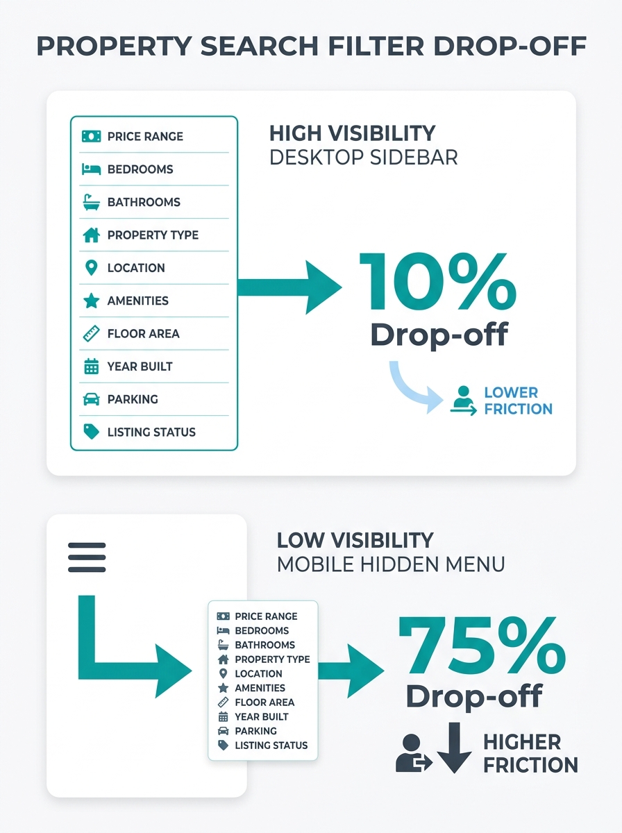
Why do mobile property searches hemorrhage users? Because the filter interface was designed for a different device entirely. A desktop search page spreads 8–12 filter options across a sidebar that’s always visible: price range, bedrooms, bathrooms, square footage, lot size, property type, year built, days on market. On a 1440px monitor, this works fine. On a 390px-wide iPhone screen, those same filters get stuffed behind a single “Filters” button that opens a cramped modal.
The result is predictable. Users tap “Filters,” encounter a wall of tiny dropdowns, and bail. According to Nielsen Norman Group’s research on filter categories, users need to “roughly predict what filter values they’ll find within each filter category and understand the differences between any two filter categories.” On mobile, where collapsed accordions contain filter values, that predictability breaks down fast.
The average real estate internet lead conversion rate falls between 0.5% and 1.5%, with performance varying significantly based on lead source, agent skill, and follow-up systems. The NAR puts it tighter, at 0.5% to 1.2%, meaning for every 200 leads captured, only 1 to 2 become paying clients. When your filter interface drives away users before they even see a listing, that already-thin conversion rate gets thinner still.
The Three-Layer Filter Stack
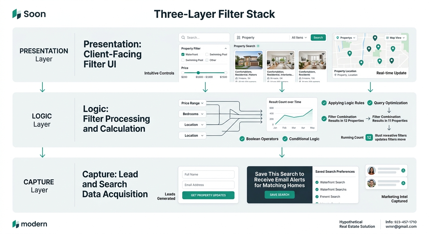
The mechanism behind effective mobile property search UX breaks down into three distinct layers, each handling a different job.
Presentation Layer determines what the user sees and touches. This includes the filter panel format (side drawer, full-screen overlay, or inline chips), the input controls (sliders, toggles, multi-select buttons), and the visual hierarchy of which filters appear first. On mobile, side drawer filters offer a more dynamic and interactive approach to filtering. Users can select multiple options, experiment with combinations, and apply their choices without losing context of the results behind the drawer.
Logic Layer controls how filters interact with each other. When a user selects “3+ bedrooms” and “$400K–$600K,” the logic layer determines whether those filters narrow results simultaneously or sequentially, whether conflicting filters produce zero-result states or automatically adjust, and how quickly the result count updates. This layer is invisible to the user but dictates whether the search feels responsive or broken.
Capture Layer is where lead generation embeds into the filter flow. Instead of treating search and lead capture as separate functions (search here, fill out a form over there), the capture layer weaves registration gates, save-search prompts, and contact triggers directly into the moments when user intent peaks.
How Side Drawers Beat Full-Screen Overlays
The presentation layer choice matters more than most agents realize. Full-screen filter overlays completely replace the search results view, forcing users into a binary state: either you’re filtering or you’re browsing. Side drawer filters, by contrast, slide in from the edge and allow users to see a sliver of results behind the panel. That sliver keeps users anchored to their search context while they adjust criteria.
When users can glimpse results updating behind their filter selections, they stay engaged longer and apply more filters. UXPin’s advanced search UX research identifies a critical requirement: “Users need to see how many results remain after applying each filter and be able to remove filters individually.” Airbnb’s filter panel is cited in the same research as a reference for managing this complexity, offering dozens of refinement options while maintaining clarity on mobile screens.
For real estate filter architecture specifically, side drawers enable what UX designers call “experimental filtering.” A buyer taps “Pool,” sees the count drop from 347 to 23, and decides whether that filter is worth keeping. Without real-time feedback, users apply filters blindly, get zero results, feel frustrated, and leave. The site that built its property details hierarchy around how buyers actually search will structure filter order to match: price and location first, then bedrooms, then property type, then amenity filters like pool or garage.
Filter Sequence as an Intent Signal
The logic layer reveals something valuable about each user: their priorities. A buyer who filters by school district before price has different motivations than one who filters by price before anything else. Recording filter sequence gives you an intent signal you can use downstream in your follow-up.
Sites fully optimized for mobile-first indexing receive 35% more organic traffic on average compared to non-optimized counterparts, according to analysis of Google’s mobile-first indexing outcomes. That additional traffic means more filter interactions, more intent data, and better lead qualification if you’re paying attention. This connects directly to the broader challenge of matching your website architecture to buyer intent.
The logic layer also handles the zero-result problem. When a user’s filter combination produces no matches, the worst response is a blank screen with “No results found.” A better response automatically suggests which filter to relax (“Try removing the ‘waterfront’ filter to see 14 more homes”) or offers a lead capture prompt (“We’ll notify you when a property matching these criteria hits the market”). That zero-result moment is peak intent. The user has told you exactly what they want, and nothing available matches it. A save-search prompt here converts at dramatically higher rates than a generic “Contact us” form buried in the footer.
The zero-result moment is peak intent. The user has told you exactly what they want, and nothing available matches. A save-search prompt here converts at dramatically higher rates than a generic contact form.
Embedding Lead Capture Inside the Search Flow
The capture layer is where mobile lead capture design diverges most sharply from desktop conventions. On desktop, lead forms live in sidebars, pop-up modals, and dedicated landing pages. On mobile, those same forms feel intrusive because they demand full-screen attention and typing on a small keyboard.
Effective mobile capture integrates into the search experience at three specific moments:
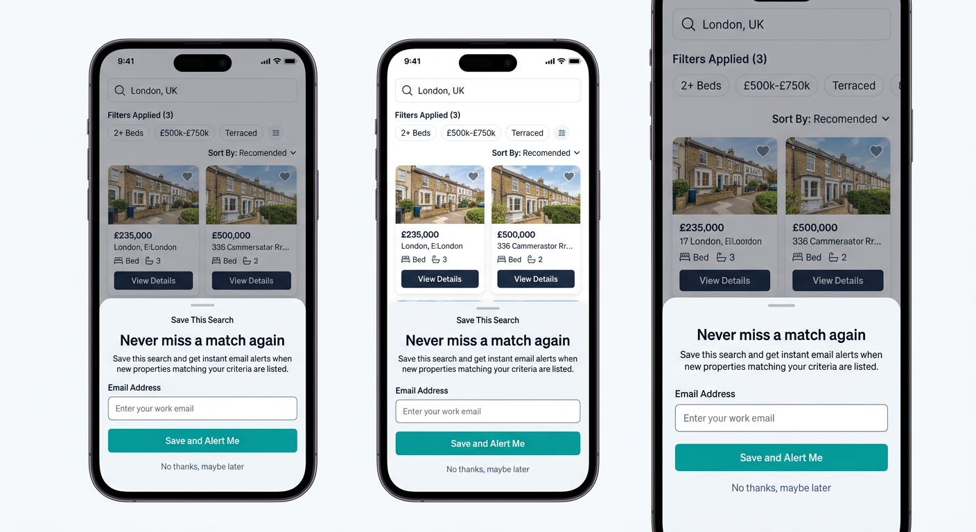
- The save-search gate. After a user applies 3 or more filters, offer a one-tap “Save this search” button. Registration requirement: email only. No phone number, no last name, no “How soon are you looking to buy?” dropdown. One field gets the conversion. The gap between a 1-field and a 4-field form on mobile is enormous, and the reasons buried forms kill conversion rates apply doubly on a 6-inch screen.
- The listing-detail gate. When a user taps on a specific listing after filtering, show the first 3–4 photos and the price, then soft-gate the full details (all photos, tax history, days on market) behind a registration prompt. The user has already demonstrated intent through filter selections and a listing click. They’ll register because they want that specific property’s information, not because you pestered them.
- The zero-result capture. When filters produce no matches, offer to monitor new listings matching those exact criteria. This is the highest-intent capture point on any property search site because the user has defined precise requirements and has nothing left to browse.
Each of these moments works because the capture is contextual. The user isn’t being asked to fill out a form for no reason. They’re being asked to do something they already want to do, and registration is the mechanism that enables it.
Tip: Keep mobile registration forms to 1–2 fields maximum. Email alone, or email plus zip code. Every additional field you add on a phone screen reduces completion rates. Qualifying questions belong in follow-up sequences, not on the initial capture form.
Where the Three-Layer Stack Breaks Down
This architecture has real limits. Sites that lose leads through poor mobile navigation often find the filter stack works in testing but fails in production for specific, fixable reasons.
Speed kills the feedback loop. Every filter interaction triggers a database query and a result count update. On mobile networks with variable latency (4G coverage in suburban and rural areas where many buyers search), a 2–3 second delay between filter tap and result update makes the interface feel broken. If your Core Web Vitals scores are already poor, adding real-time filter feedback makes things worse. The filter logic needs to be partially client-side, pre-loading result counts for common filter combinations. That requires engineering investment most template-based real estate sites don’t support.
IDX data gaps undermine filter design. Most agent and brokerage sites pull listings from their MLS through an IDX feed, and those feeds often restrict which fields are filterable and how frequently data refreshes. You can design a beautiful filter interface for “EV charging” or “solar panels,” but if your IDX feed doesn’t include those fields, the filter returns nothing useful. The gap between the filters users want and the data your feed provides is a constant tension that no amount of UX polish fixes.
Over-gating sends users to Zillow. Requiring registration too early in the search process drives buyers to portals where they can search freely. The capture layer works because it triggers at peak-intent moments, not at the front door. Agents who gate the initial search behind a registration wall see higher bounce rates and lower lead quality because motivated buyers leave while only casual browsers comply. Given that the baseline conversion rate on real estate leads sits around 0.4% at the low end, you can’t afford to filter out the motivated searchers before they even start.
The Three-Layer Filter Stack produces its best results when all three layers are purpose-built for mobile rather than adapted from desktop, when the site’s infrastructure supports real-time feedback at mobile-network speeds, and when capture prompts tie to genuine intent signals. Remove any one of those conditions, and the architecture degrades from a lead generation system into something that actively pushes your best prospects toward your competitors.