
Buttons labeled “Contact Me” and “Submit” convert at a fraction of the rate of intent-matched alternatives because they demand high-commitment actions from low-commitment visitors. The mechanism behind CTA failure on property pages operates across five layers, from copy and placement to mobile rendering and downstream follow-up speed.
TL;DR: Real estate CTA design fails when buttons ask visitors to jump to phone calls or form submissions before those visitors have built enough trust to act. The fix operates across five structural layers: intent mismatch, placement blindness, mobile degradation, competing buttons, and generic copy. Addressing them in order, starting with intent alignment, produces the largest property page conversion rate gains.
The Core Failure: Asking Too Much, Too Soon
Why does the standard “Schedule a Consultation” button convert so poorly on listing pages? Because the visitor’s intent at that moment is informational, not transactional. They want square footage, neighborhood comps, and price context. Asking them to jump to a phone call skips three or four trust-building steps.
Jay Thompson, former Director of Industry Outreach at Zillow, has noted that generic requests like “Call me” fail because they offer no unique benefit to the visitor. The button gives the agent what the agent wants (a phone number) rather than giving the visitor what the visitor wants (better property information).
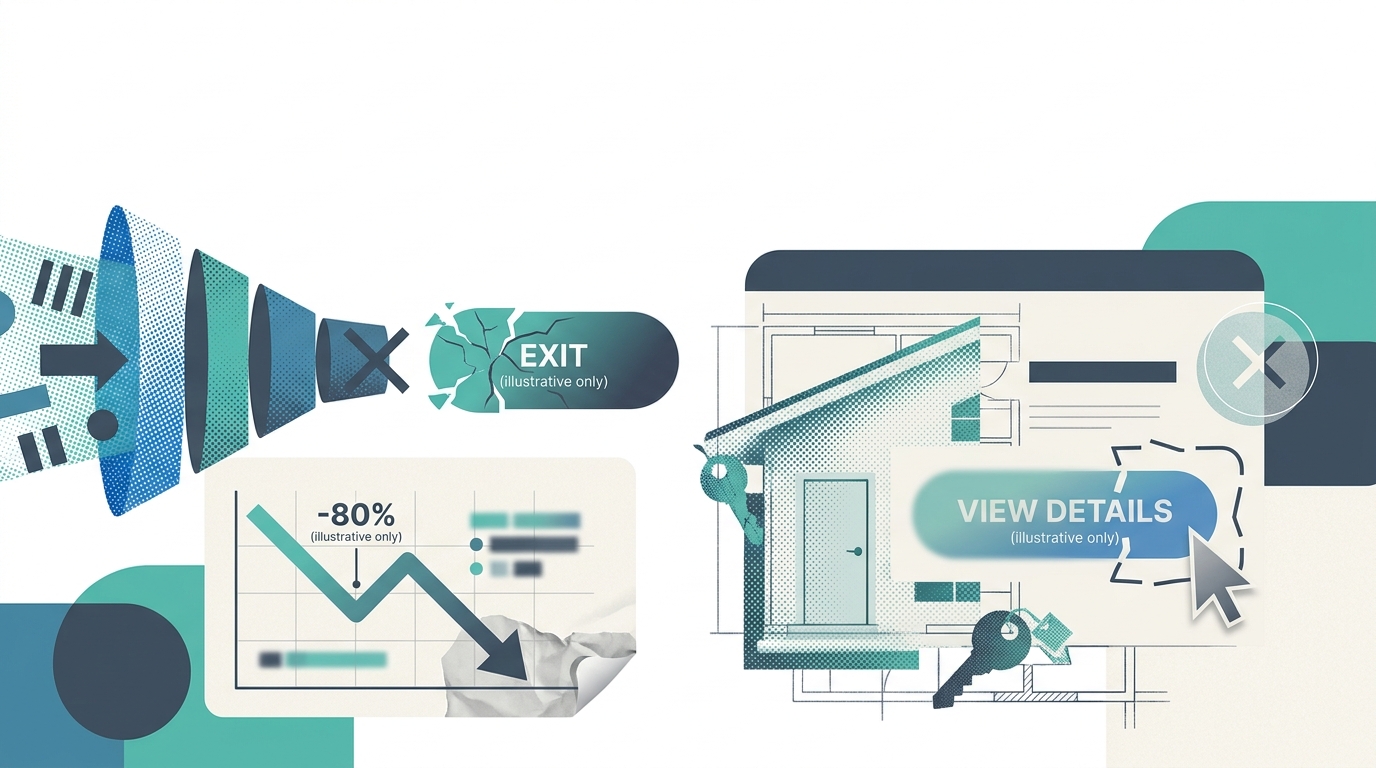
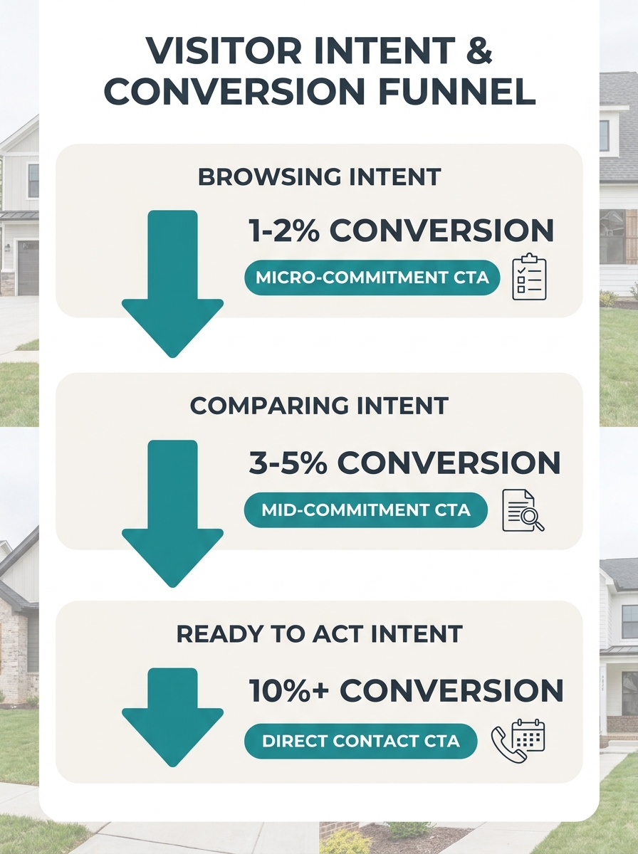
The data here is blunt. Nationally, only 0.4% to 1.2% of real estate leads convert to actual sales, according to Heyflow’s 2026 funnel analysis. That rock-bottom close rate means your lead generation funnel optimization has to start earlier than most agents realize. You need massive top-of-funnel volume, and massive volume requires low-friction entry points.
Micro-commitment CTAs (“Browse Homes Under $500K,” “See What Your Home Is Worth,” “Get the Neighborhood Report”) pull 10-15% better conversion rates when placed above the fold compared to generic contact buttons in the same position. They offer immediate value without demanding personal information upfront. Exit-intent pop-ups carrying similar low-commitment offers can recover an additional 10-15% of abandoning visitors by surfacing one final value exchange before the browser tab closes.
CTAs placed at the end of substantive content sections (after listing descriptions, after neighborhood guides) see a 20-30% conversion boost versus random sidebar placements. The visitor has consumed information, built a baseline of trust, and now has context for why filling out a form makes sense.
Placement Follows Attention, Not Aesthetics
A perfectly worded CTA buried below three photo galleries and a mortgage calculator might as well not exist. Conversion button placement follows predictable eye-tracking patterns, and most real estate sites violate them.
Homar Real Estate’s CTA optimization research identifies three hot zones: above the fold, mid-content (after the visitor has absorbed enough detail to feel informed), and at logical endpoints like the bottom of a listing description. The recommended testing protocol runs A/B experiments across all three positions over 2-4 weeks, depending on traffic volume, before committing to a layout.
We covered this problem from the visual hierarchy angle in our piece on why image galleries bury conversion opportunities. The short version: your largest, most eye-catching page elements (hero photos, map embeds, virtual tour widgets) train the visitor’s eye to sweep past the exact spots where your CTA sits.
The fix is intentional repetition of a single primary CTA across those three zones on one page. Foundry CRO’s 2026 benchmarks report that single-CTA landing pages average a 13.5% conversion rate across all industries (Unbounce data). Adding a competing secondary CTA drops that rate unless the secondary serves as a lower-commitment fallback rather than a rival action. “Schedule a Private Tour” as the primary, repeated three times on the page, with a single “Save This Listing” button as the fallback, gives the visitor clarity instead of a decision maze.
Tip: Test three placements of the same primary CTA on each property page (top, mid-scroll, post-description) before adding any secondary buttons. Measure for two full weeks at minimum before drawing conclusions.
Mobile Rendering Undoes Desktop Wins
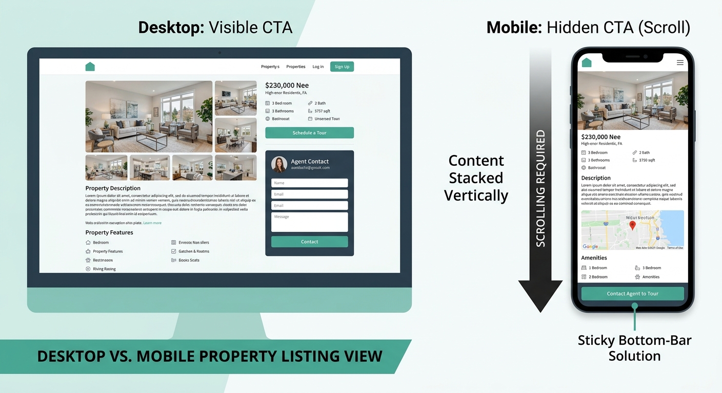
Over 58% of real estate website traffic arrives from mobile devices, per BEE Free’s landing page analysis. For global audiences browsing on the go, that number runs even higher. And mobile doesn’t just shrink your CTA. It relocates it, changes how much surrounding context the visitor sees, and sometimes makes the button physically difficult to tap.
A button that sits elegantly beside a listing description on desktop often collapses below three screen-lengths of stacked content on mobile. The visitor who would have seen it at a glance now scrolls past photos, descriptions, neighborhood maps, and school ratings before the CTA enters the viewport. If your mobile navigation adds friction at exactly these moments, you lose visitors who were interested enough to browse but not patient enough to hunt.
Sticky bottom-bar CTAs (the persistent button fixed to the mobile screen’s lower edge) solve viewport visibility, but only if the bar is thin enough not to obscure content and labeled clearly. A 95.8% majority of buyers report that the tone and clarity of CTA language influences whether they fill out a form. A tiny, vague sticky bar labeled “Go” creates confusion rather than action.
Generic Copy Repels the Visitors You Want Most
“Submit.” “Contact Us.” “Learn More.” These labels tell the visitor nothing about what happens after the click. That ambiguity creates friction at the exact moment you need momentum.
As Propphy’s CTA research puts it: “Confusion kills conversion; specificity and low friction win.” A button reading “Send Me New Listings in Bellingham” outperforms “Sign Up for Alerts” because it answers three questions at once: what will I get, how relevant will it be, and how much effort is involved?
A button reading “Send Me New Listings in Bellingham” outperforms “Sign Up for Alerts” because it answers three questions at once: what will I get, how relevant will it be, and how much effort is involved?
The specificity principle extends to ad-to-page alignment. When an ad promises “Bellingham waterfront under $1M,” the landing page CTA must reflect that exact search. Visitors who click a specific ad and land on a generic page with a generic button experience a trust break. Their property page conversion rate drops because the page didn’t deliver on the promise that brought them there.
First-person phrasing adds another measurable lift. “Send me new listings” outperforms “Get new listings” because the first-person framing (“me,” “my”) creates psychological ownership of the action. And agents who A/B test CTA language consistently achieve a 57.8% higher conversion rate than those who pick a button label once and never revisit it. Videos featuring clear CTAs see 23% higher conversion rates than those without a specific prompt, reinforcing that the specificity principle holds across media types, not just website buttons.
The Competing-Button Trap
Property pages commonly carry “Schedule a Showing,” “Contact Agent,” “Save Listing,” “Get Pre-Approved,” and “Share This Listing” all visible at once. Each additional choice increases cognitive load and decreases the likelihood of any single action being taken.
Emails with a single, clear CTA generate 371% more clicks than those with multiple CTAs. The same principle holds on property pages, which function as landing pages whether agents think of them that way or not. The website-to-CRM conversion bottleneck often starts right here: five buttons on a page, zero clarity about which one the visitor should press, and the CRM either receives nothing or captures an accidental form submission from a confused user.
| Number of Visible CTAs | Visitor Behavior | Conversion Impact |
|---|---|---|
| 1 primary CTA (repeated) | Clear action path, low cognitive load | 13.5% average conversion (Unbounce benchmark) |
| 1 primary + 1 fallback | Two-path choice, high-intent and low-friction | Slight reduction, offset by capturing cautious visitors |
| 3+ competing CTAs | Decision paralysis, scattered clicks | Measurable drop; visitors abandon or click the wrong button |
| 5+ buttons + icons | Visual noise, no clear hierarchy | Highest abandonment rates; CRM receives low-quality leads |
Every property page needs exactly one primary CTA and, optionally, one secondary fallback that requires less commitment. “Schedule a Private Tour” paired with “Save This Listing” gives visitors two clear paths. Anything beyond two visible actions on a single screen starts eroding your numbers.
Where the Mechanism Breaks
This five-layer model assumes something that’s frequently untrue: that visitors landing on your page match the intent stage you designed for. A seller browsing your buyer-focused listing page, a tire-kicker from a social ad, a relocating buyer with a pre-approval letter, and an investor running comps all hit the same property page carrying radically different intent levels. No single CTA hierarchy serves all four visitors perfectly.
The partial fix is page-level CTA design. Buyer pages get buyer CTAs. Seller landing pages get seller-specific value offers. Neighborhood guide pages get low-friction “Get the Full Report” buttons. Redesigning your homepage around actual browsing behavior helps route different visitor types to different pages, each with its own CTA structure tuned to the right intent stage.
But even the best real estate CTA design hits a wall when downstream follow-up fails. Research from Listings to Leads identifies five conversion killers that live beyond the click: lack of follow-up, ineffective communication, poor lead quality, absent value proposition, and failure to nurture over time. A perfect button that generates a lead and then triggers a “just checking in” email three days later has converted nobody. The mechanism works end to end, from the first viewport to the final appointment confirmation, or the button optimization was an expensive distraction that moved the failure point deeper into the funnel where it’s harder to find.