

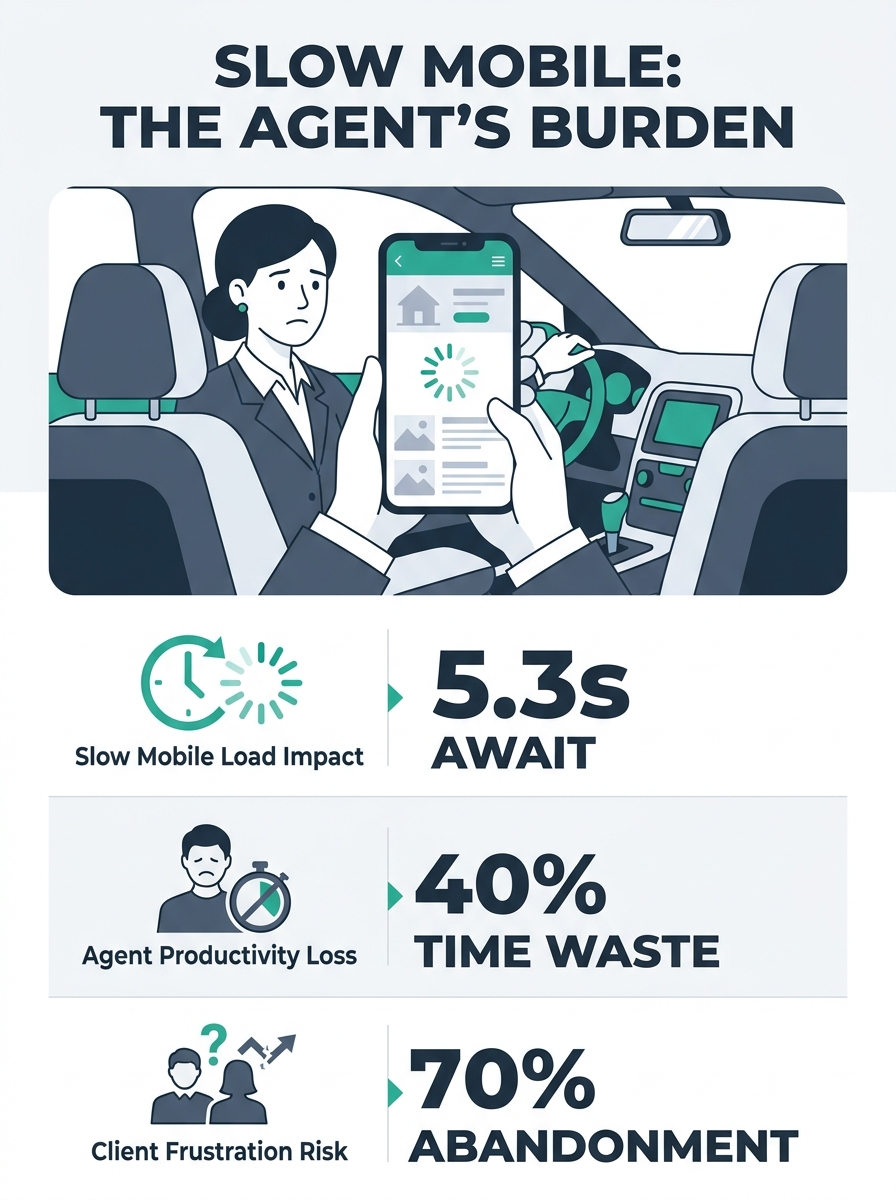
Desktop conversion rates for real estate websites sit around 3.82% globally, according to data compiled by WebFX. Mobile conversion rates? About 1.32%. That’s a 65% drop, and the gap widens further in the U.S., where mobile dips to 1.22%. The strange part is that real estate professionals spend thousands on website redesigns, A/B test their headline copy, agonize over hero images—and never once pull up their own site on a phone using cellular data in a parking lot. The conversion leak isn’t mysterious. It lives in specific, diagnosable places on the mobile version of your site. These seven rules will help you find them.
Always test on a real phone over cellular data first
Chrome DevTools has a responsive preview mode. It’s useful for checking layout breakpoints. It is terrible for understanding what your site actually feels like to a buyer sitting in their car after a showing, thumb-scrolling through listings on LTE.
The reason: DevTools doesn’t replicate real network latency, touch response lag, or the way your phone’s browser handles JavaScript differently than Chrome on a MacBook. As Contempo Themes noted in their analysis of failing real estate sites, testing on actual mobile devices using cellular data uncovers rendering glitches and load-time problems that desktop simulations consistently miss.
Buy a $150 Android phone. Keep it in your desk drawer. Every time you push a change to your site, pull it out, open Chrome on that phone, and navigate your full conversion flow—from homepage to listing page to contact form submission. If you don’t own a cheap test device, borrow one. The point is to experience the worst-case scenario your visitors face, because a meaningful chunk of home buyers aren’t browsing on the latest iPhone Pro.
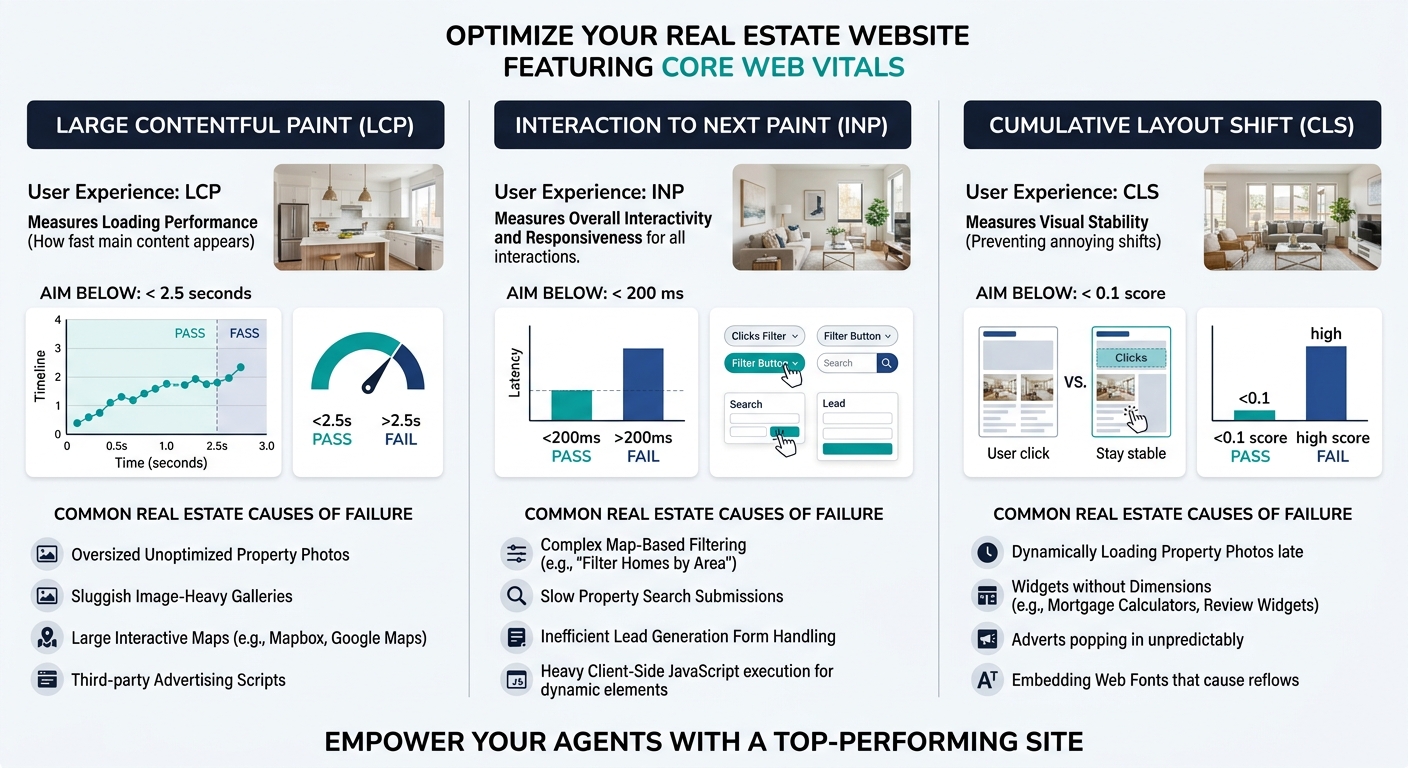
Measure your Largest Contentful Paint before touching anything else
Before you redesign buttons or rewrite CTAs, run Google PageSpeed Insights on your top five landing pages—your homepage, your main search page, your three highest-traffic listing pages. Look at one number first: Largest Contentful Paint (LCP).
LCP measures how long it takes for the biggest visible element (usually your hero image or listing photo gallery) to render. Google’s threshold is 2.5 seconds. If your mobile LCP exceeds that, everything downstream—your forms, your calls-to-action, your chat widget—is fighting an uphill battle because visitors have already decided your site feels slow.
The most common LCP killers on real estate sites are uncompressed listing photos (agents upload 4,000 × 3,000 pixel images straight from their photographer), render-blocking JavaScript from third-party chat tools and analytics scripts, and hero video backgrounds that look gorgeous on desktop but choke a mobile connection. Fix those three things and you’ll often shave 1–2 seconds off your load time without changing a single line of copy.
Pair this with Interaction to Next Paint (INP), which should stay under 200 milliseconds, and Cumulative Layout Shift (CLS), which should remain below 0.1. Together, these Core Web Vitals tell you whether your site is structurally capable of converting on mobile before you even get into UX design decisions.
Make every tap target at least 48 pixels—especially on forms
Desktop users click with a mouse cursor that’s roughly 1 pixel wide. Mobile users tap with a thumb pad that covers 45–50 pixels of screen space. When your “Schedule a Showing” button is 32 pixels tall and wedged between a phone number link and a social sharing icon, you’re guaranteeing accidental taps, frustration, and abandonment.
Google’s own accessibility guidelines specify a minimum tap target of 48 × 48 pixels, with at least 8 pixels of spacing between adjacent targets. Pull up your listing pages on your test phone and try to tap the contact button cleanly on the first attempt. Then try tapping the form fields. If you have to zoom in or carefully aim your thumb, your responsive design lead capture is broken in a way that no amount of copywriting will fix.
This problem is especially severe on form-heavy pages. If you’ve already audited your lead capture forms for desktop conversion issues, go back and repeat that audit with a focus on mobile touch targets. Fields that stack neatly on a wide screen often compress into a cramped column on mobile, with dropdown menus that are nearly impossible to select accurately.
Tip: Open your site on your phone and try to complete your own lead form using only your thumb. Time yourself. If it takes more than 30 seconds or requires any pinch-to-zoom, your form needs a mobile-specific redesign.
Kill every hover-dependent interaction
Hover states don’t exist on touchscreens. This sounds obvious, but it catches real estate sites constantly. The three worst offenders:
Navigation menus that reveal subcategories on hover. On desktop, a visitor hovers over “Properties” and sees dropdowns for “Single Family,” “Condos,” “Luxury.” On mobile, they tap “Properties” and either nothing happens, or they’re taken directly to a page they didn’t want. The subcategories vanish.
Listing cards that show details on hover. Some templates overlay the price, address, and bedroom count when a cursor hovers over the listing thumbnail. On mobile, that information is permanently hidden. Visitors see a grid of photos with no context, which compounds the property page hierarchy problem by making it impossible to scan and compare listings.
Map pin tooltips. Interactive maps are a staple of IDX-powered real estate sites. On desktop, hovering over a map pin reveals a quick preview of the property. On mobile, those tooltips either don’t appear or stack on top of each other. Visitors tap a pin, get a flash of information, and lose it when they try to interact further.
The fix for all three: make every piece of information accessible through a single tap or visible by default. If information requires a hover to appear, it needs a mobile-specific alternative.
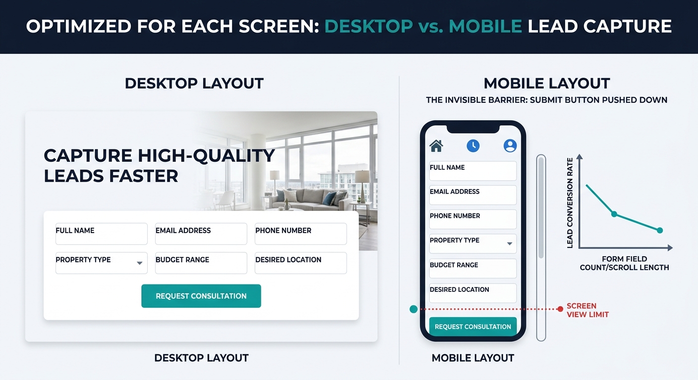
Reduce your lead form to one scrollable screen
On desktop, a six-field form with name, email, phone, message, property interest, and timeline feels reasonable. The fields sit side by side in two columns, the submit button is visible without scrolling, and the whole thing takes 30 seconds to complete.
On mobile, that same form becomes a vertical stack that pushes the submit button below the fold. The visitor fills in their name, scrolls. Fills in their email, scrolls. By the time they reach the message field, they’ve lost sight of why they started filling out the form in the first place. And research on real estate lead nurturing and conversion consistently shows that the longer a form takes, the more likely the visitor is to abandon it partway through.
If your submit button isn’t visible on mobile without scrolling past the last form field, you’ve already lost a double-digit percentage of potential leads.
For mobile conversion optimization in real estate, the rule is simple: name, email, phone. Three fields maximum on the initial capture. You can qualify the lead later with follow-up questions via email or text. The goal of the mobile form is to get the conversation started, not to gather a full buyer profile. Everything you’ve worked on with CTA placement and button positioning falls apart if the submit button lives in a place nobody scrolls to.
Audit your property search filters for thumb usability
Property search is where real estate sites live or die on mobile. Buyers want to filter by price range, bedrooms, neighborhood, and property type. On desktop, sidebar filters with checkboxes and sliders work reasonably well. On a phone screen, those same filters create problems that tank engagement.
The most common failure: range sliders. A price range slider that works perfectly with a mouse becomes an exercise in frustration when you’re trying to drag a tiny handle with your thumb on a 6-inch screen. The handles are too small, they jump past the value you want, and on many implementations they require a precision that touch input can’t deliver. Replace range sliders with pre-set price brackets or simple dropdown menus on mobile.
Checkbox lists create similar friction. If your site offers 15 neighborhood options as a vertical checkbox list, mobile users have to scroll through all of them inside a cramped filter panel while the rest of the page sits frozen. Collapsible filter groups with clear “Apply” and “Clear” buttons solve this. And if you’ve already identified a search filter gap in your conversion funnel, the mobile version is almost certainly where the gap is widest.
A useful benchmark for mobile UX testing for agents: watch five people use your site’s search filters on their phones. If more than one person gives up or resets the filters out of frustration, your filter UI needs work.
Run a mobile real estate website audit quarterly, not once
Agents tend to treat their website as a “set it and done” asset. You build it, maybe redesign it every two or three years, and assume it works the same way it did on launch day. But your site’s mobile performance degrades over time in ways you won’t notice from your desktop.
Third-party scripts accumulate. Your CRM adds a tracking pixel. Your chat widget updates its JavaScript bundle. Your IDX provider pushes a template change. Each of these individually might add 200 milliseconds to your mobile load time. Stack six of them over twelve months and you’ve added more than a second—enough to push your LCP past the 2.5-second threshold and start bleeding conversions.
Build a quarterly mobile audit into your workflow. Run PageSpeed Insights, test on your cheap Android phone, attempt your own form submissions, and check that your property search filters still work cleanly with thumb input. This doesn’t need to be a full website architecture review. Twenty minutes with your phone and Google’s free tools will catch 80% of the problems that cause mobile conversion to decay.
When These Rules Break Down
These seven rules apply to the vast majority of agent and brokerage websites. They don’t apply equally to every situation.
If your analytics show that real estate browsing in your market still favors desktop—which is true for some luxury markets where buyers do extended research sessions on laptops—you might reasonably prioritize desktop UX and treat mobile as secondary. But verify this with your own data, not assumptions. Check your Google Analytics device breakdown for the last 90 days before deciding.
If you’re running paid campaigns where the landing page is purpose-built and separate from your main site, some of these rules (particularly around navigation and search filters) won’t apply because those pages are stripped down by design.
And if your site genuinely converts well on both desktop and mobile already, resist the urge to audit for the sake of auditing. The goal of a mobile real estate website audit is to close a measurable gap between desktop and mobile performance. If the gap doesn’t exist, spend your time on something else—like the content and local SEO work that drives traffic to the site in the first place.
The one rule that never breaks: test on a real phone. Always. No matter how good your site looks in a browser preview, the phone in your hand will tell you what your visitors actually experience. And what they experience determines whether they fill out that form or tap the back button and find another agent.