
Putting a “Schedule a Showing” button at the top of every property page is the single most common CTA placement mistake on real estate websites. It sounds counterintuitive. The conventional wisdom says: make your primary call-to-action visible immediately, above the fold, before the visitor scrolls. And for some pages on your site, that’s correct. But applied uniformly across every page, that rule actively suppresses conversions by asking visitors to commit before they’ve seen the listing photos, the price context, or the neighborhood details that would actually motivate them to click.
The rest of this article defends that claim with three bodies of evidence: what scroll-behavior data reveals about when visitors are ready to act, how property page design optimization differs from homepage optimization, and why mobile-specific placement matters more than desktop above-the-fold conventions.
Decision Readiness Determines Button Timing
Here’s the core problem with blanket above-the-fold CTA placement on real estate sites. A visitor who lands on your homepage via a Google search for “homes for sale in [city]” has different intent than someone who clicked a specific listing from your email newsletter. The homepage visitor is browsing. The listing-click visitor already has interest in a particular property. Both visitors see your site, but they’re at fundamentally different stages of readiness to take action.
A well-documented case study found that moving a CTA well below the fold for complex services increased conversions by 304%. The reason: visitors needed to consume enough information to feel confident clicking. Real estate is exactly this kind of high-stakes decision. Nobody schedules a showing based on a thumbnail and an address line.
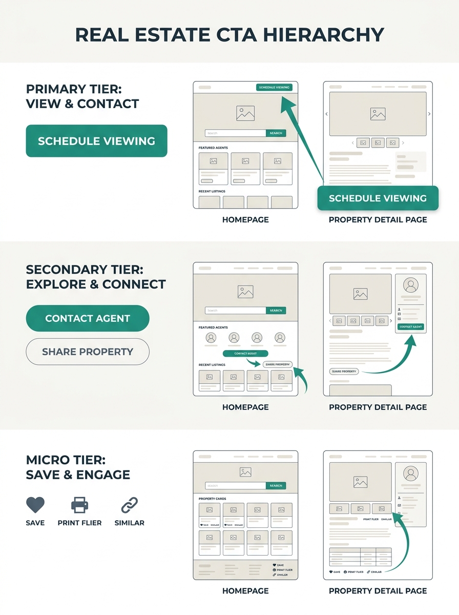
This is where CTA hierarchy becomes critical. A useful framework breaks real estate website conversion buttons into three tiers:
- Primary CTAs for your main conversion goal (consultation request, listing appointment)
- Secondary CTAs for lower-commitment actions (download a market report, join a newsletter)
- Micro-CTAs for engagement (save a listing, share, bookmark)
On your homepage, a primary CTA above the fold makes perfect sense because visitors expect a search bar or a “Find Homes” prompt. That matches their intent. But on individual property pages, the primary CTA (“Schedule a Showing” or “Ask About This Property”) performs better when placed after the photo gallery and key property details. The visitor needs context before they’ll commit.
If you’re still building out your site’s page structure, you can see example property websites to understand how different layouts handle this hierarchy in practice.
Property Pages Follow Their Own Placement Rules
The generic advice to put CTAs “in visible spots like the homepage, property listings, and contact page” is directionally correct but frustratingly vague. Where on a property listing? After which section? According to research from Agent Image, the most effective placements follow the content’s natural rhythm: above the fold for early interest, mid-content after listings or reviews, footer-level for end-of-scroll reinforcement, and contextual positions after specific content blocks.
For a property detail page specifically, here’s what the data supports:
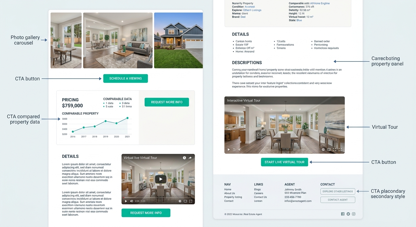
After the Photo Gallery
Visitors who scroll through all listing photos have signaled high interest. A “Schedule a Tour” button placed immediately after the gallery catches them at peak engagement. This is the single highest-converting position on most property pages because the visitor just invested time and attention into imagining themselves in the home.
After Price and Neighborhood Comparables
Once someone sees the asking price alongside recent comps, they’re mentally evaluating affordability. A secondary CTA here (“Get Pre-Approval Info” or “See My Monthly Payment”) matches that evaluation moment perfectly.
After Virtual Tour or Video Content
Listings with VR tours receive 40% more inquiries and close 31% faster than traditional listings, according to data from Marquee Solution. If you embed a virtual tour on your property page, place a CTA immediately after it. The visitor has just experienced the property spatially, and that emotional state converts well.
At the Page Footer
A final CTA reinforces the action for visitors who consumed everything on the page. Don’t repeat the same button text from above. If your mid-page CTA said “Schedule a Tour,” your footer CTA might read “Still Have Questions? Let’s Talk” to capture visitors who are interested but not yet ready for an in-person visit.
One primary action per screen. When a visitor sees two equally prominent buttons competing for attention, conversion rates drop.
The critical principle from Propphy’s CTA playbook is one primary action per screen. Make your primary CTA visually dominant with a high-contrast color and larger size, and keep secondary options visually muted with ghost-style buttons or text links. Too many choices create paralysis, and paralysis means the visitor clicks nothing.
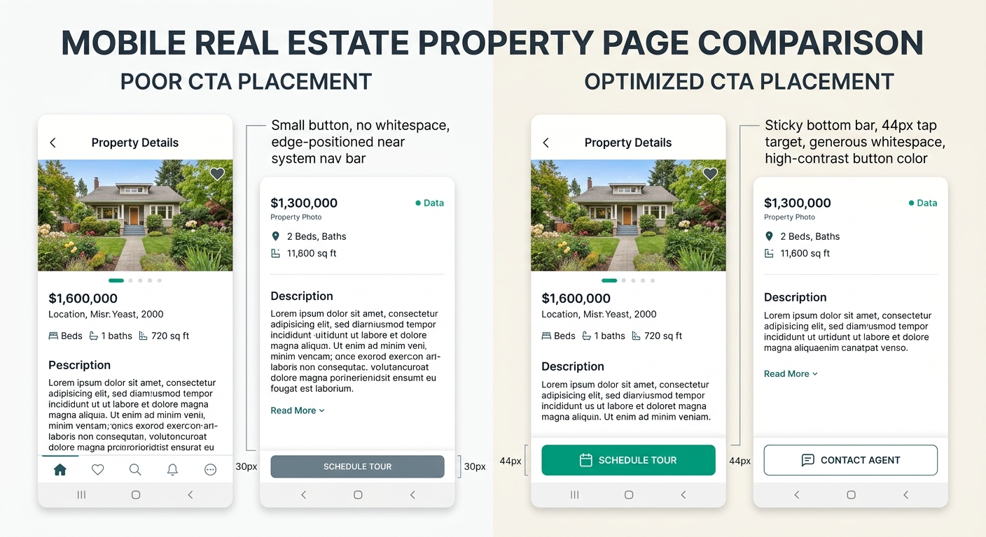
Mobile Placement Is a Separate Problem Entirely
More than half of real estate website traffic comes from phones. And mobile visitors don’t scroll the same way desktop users do. They thumb-scroll fast, they miss small buttons, and they abandon pages that feel cluttered. Your lead capture forms on real estate pages need to account for this difference explicitly.
Sticky buttons work. A fixed “Contact Agent” bar at the bottom of the screen keeps the primary CTA accessible as visitors scroll through listing photos and details. Google’s UX research found that mobile-optimized CTAs see 42% higher tap-through rates, and button-shaped CTAs get tapped more than twice as often as text links on mobile screens.
Tap targets need room. The WCAG 2.1 standard recommends a minimum 44×44 pixel tap area. If your lead capture forms have submit buttons smaller than that, you’re losing conversions to fumbled taps. And buttons placed too close to the screen edges get missed because of interference from mobile navigation bars and system gestures.
Whitespace around buttons pays for itself. Surrounding a CTA with generous blank space can increase conversions by up to 232%. On mobile, where screen real estate feels precious, agents often cram buttons between content blocks with minimal padding. Resist that instinct. A button floating in open space draws the eye precisely because nothing else competes with it.
Luxury Presence’s CTA guide reinforces this: use contrasting colors to make your CTA button stand out from surrounding content, and position it where it represents a reasonable next step in the user’s path. On mobile, “reasonable next step” often means after the visitor has scrolled past the hero image and read at least the property highlights.
If you’re working through your broader lead generation strategy, mobile CTA placement should be one of the first things you audit. The gap between mobile traffic volume and mobile conversion rates on most agent sites is enormous, and button placement is usually the simplest fix available.
Tip: Test your property pages on your own phone before anything else. Tap every button with your thumb. If you have to pinch-zoom or aim carefully, your visitors are experiencing the same friction and most of them won’t bother trying twice.
The Thesis, Pressure-Tested
The argument here isn’t that above-the-fold CTAs are bad. They’re appropriate on homepages, landing pages, and search-results pages where visitor intent is already established. The argument is that applying above-the-fold placement as a universal rule across your entire real estate website produces the opposite of its intended effect on property detail pages, blog posts, and neighborhood guides. Those pages need to earn the click by delivering value before asking for commitment.
Your homepage search bar should be prominent and immediate. Your property page “Schedule a Tour” button should appear after the photo gallery, not above it. Your lead capture forms should follow content that gives visitors a reason to fill them out. And every button on mobile needs a 44px tap target, breathing room, and a color that contrasts hard against its background.
A/B testing remains the only reliable way to confirm what works for your specific audience. The research from Agent Image recommends testing two versions of a CTA with different text, colors, or placements and measuring which converts better. Even small changes produce meaningful differences when your site handles hundreds of listing views per week. If you’re looking for a broader framework to plan and track these experiments, building out a structured marketing calendar helps you schedule tests alongside your other campaigns so optimization doesn’t quietly fall off the priority list.
The standard CTA placement playbook gets things half right. The other half, the part that accounts for page type, scroll depth, decision readiness, and device context, is what separates a site visitors browse from a site that actually generates leads.