

Where you place your call-to-action button on a mobile listing page affects lead capture more than its color, copy, or design polish. Google’s 2026 Mobile UX Benchmarking Report found that properly sized and positioned CTAs achieve a 49% higher tap-through rate, and mobile CTA optimization overall lifts conversions by 32.5%.
The Desktop Layout, Shrunk to Fit
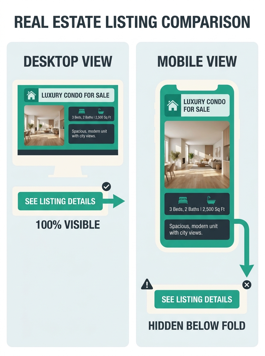
When responsive design frameworks first hit real estate websites around 2014 and 2015, most brokerages and agent sites took the path of least resistance. They kept their desktop page structure intact and let CSS media queries collapse it into a single column for phones. The “Schedule a Showing” or “Contact Agent” button sat wherever it happened to land after the hero image, the full property description, the room-by-room specs, and the neighborhood overview all stacked on top of each other.
On a desktop screen, that structure put the CTA roughly 700-900 pixels below the fold. On a 5.5-inch phone screen, the same page pushed it to 2,500 pixels or more below the initial viewport. NAR data shows over 76% of homebuyers use a mobile or tablet device during their property search. The majority of your visitors were scrolling through a layout that buried the single most important conversion element far below the point where most people stopped reading.
The underlying property page hierarchy problem was structural. Agents obsessed over button colors (green vs. orange, rounded vs. square) while 60-70% of mobile visitors never scrolled deep enough to encounter the button at all. No amount of design refinement helps a button nobody sees.
The Thumb-Zone Hypothesis Changes Placement Logic
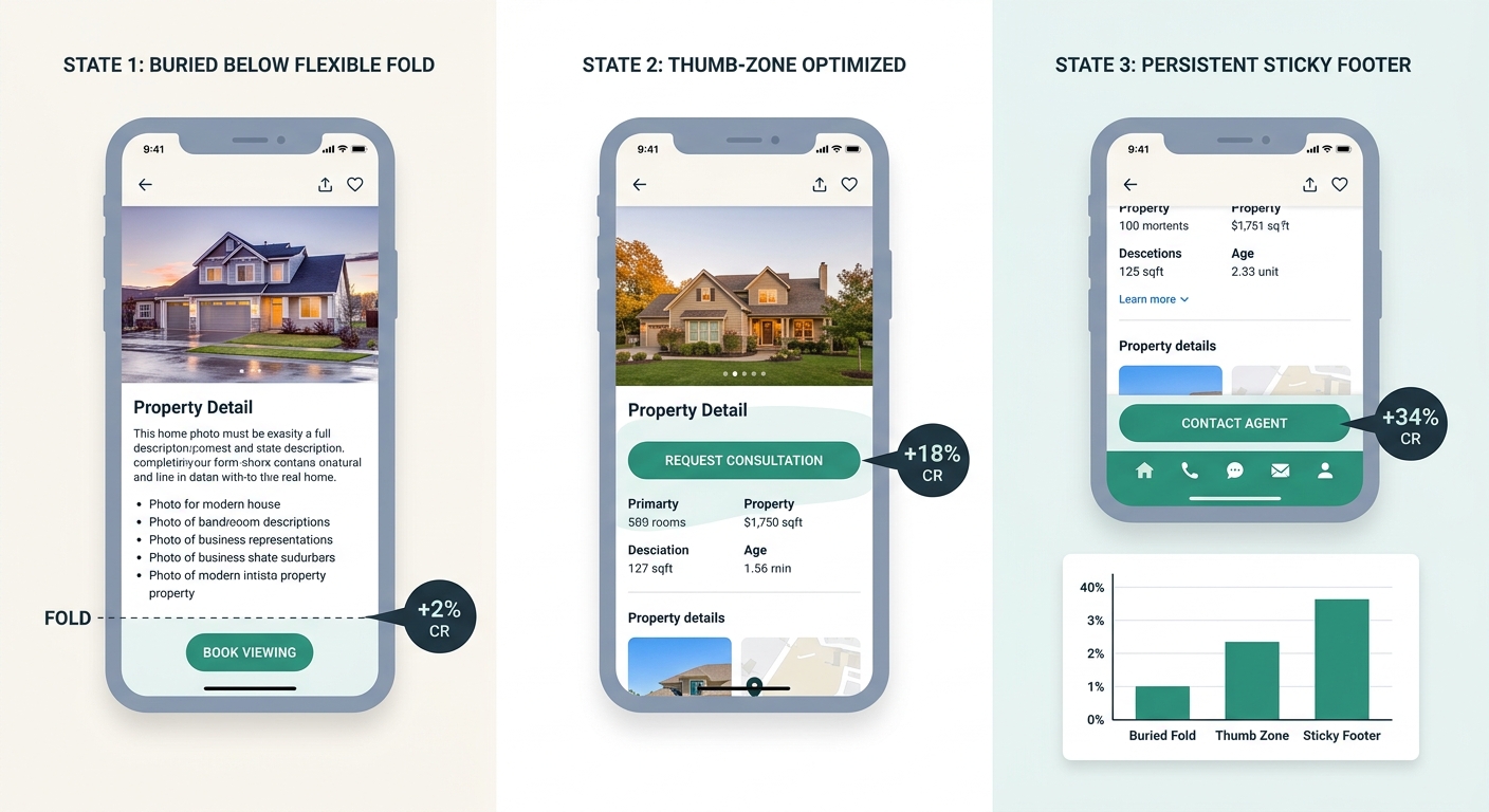
Around 2017-2018, UX research from Steven Hoober and Josh Clark popularized the concept of the “thumb zone” for mobile interfaces. Their work mapped how people hold their phones and which screen areas are easy, awkward, or impossible to reach with one-handed use. The bottom-center and bottom-right of the screen emerged as the highest-comfort zones for tapping.
Real estate app developers at Realtor.com and Redfin were among the first in the industry to act on this data. Both platforms moved key interaction elements toward the bottom of the screen, integrating map-based browsing and virtual tours with persistent bottom navigation bars. The assumption was simple: if the button is in the thumb zone, more people will tap it.
But a 2025 study by UX researcher Elise Warren complicated that assumption. Warren found that 78% of users expected the primary action button to be the top button in a two-button stacked pattern, regardless of thumb reachability. Mental models, it turned out, competed directly with physical convenience. Users who encountered a “Contact Agent” button in an unexpected position hesitated, even if the position was technically easier to reach.
This is where property search mobile UX patterns diverge from generic app design advice. Real estate searchers behave differently than social media scrollers or e-commerce shoppers. They’re comparing multiple listings in rapid succession, spending an average of 3-4 minutes per listing page, and they’ve developed strong expectations about where to find contact options based on Zillow and Realtor.com’s dominant interfaces.
Sticky Footers and the Always-Visible CTA
The practical solution that emerged from the thumb-zone era was the sticky CTA bar: a narrow footer element pinned to the bottom of the screen that stays visible as visitors scroll. Zillow, Redfin, and Homes.com all adopted variations of this pattern between 2019 and 2021, and the approach quickly filtered down to template providers like IDX Broker, Showcase IDX, and kvCORE.
The impact was measurable. Sites that moved from a static below-the-fold CTA to a sticky footer saw conversion rate increases ranging from 25% to 40%, depending on the baseline. According to conversion optimization data from Webless, optimizing mobile CTAs improves conversion by 32.5% on average, and the sticky footer was the single biggest driver of that improvement.
But the sticky footer solved the visibility problem while introducing new ones. On smaller screens (5 inches and under, still common in many markets), a 60-pixel sticky bar consumed meaningful viewport real estate, obscuring property photos or description text. Agents using mobile-first property search filter designs noticed that the sticky bar sometimes competed with filter controls, creating a cluttered bottom-of-screen experience that hurt browsing even as it improved lead capture access.
When A/B Tests Challenged Design-First Thinking
The real inflection point for call-to-action button positioning on listings came when enough brokerages and agent sites had accumulated A/B test data to compare design changes against placement changes head-to-head.
Avintiv Media’s analysis of CTA test results found that clear, specific CTAs can increase conversion rates by up to 161%, but the word “specific” in that finding does critical work. Specificity here means matching the CTA’s text and position to where the user is in their decision process on the page. A “Schedule a Tour” button placed immediately after the photo gallery converts at a different rate than the same button placed after the property description, and both outperform a generic “Contact Us” buried at the page bottom.
Google’s 2026 Mobile UX Benchmarking Report added hard numbers to the sizing and spacing dimension. CTAs sized at a minimum of 48×48 pixels with at least 16px of surrounding white space achieved that 49% higher tap-through rate compared to undersized alternatives. That finding matters because many real estate website templates ship with CTA buttons that meet the minimum size on desktop but compress below the 48-pixel threshold on mobile screens.
Warning: Check your mobile CTA dimensions right now: pull up your listing page on your phone, take a screenshot, and measure the button. If it’s below 48×48 pixels with less than 16px padding on each side, you’re losing taps to fat-finger errors and visual crowding, regardless of how polished the button looks.
The data pattern across multiple test sets tells a consistent story. Urgency-based CTAs (“Schedule a Tour This Week” instead of “Contact Agent”) increase conversions by 332%, according to Webless’s research. But that 332% lift only materializes when the button is visible at the moment the user feels urgency. Put the same urgency-laden copy at the bottom of a 3,000-pixel page, and its performance drops to baseline.
A beautifully designed CTA button that 70% of mobile visitors never scroll far enough to see converts at zero percent, no matter how good the copy or color choice.
The compound effect works like this: position determines whether the button gets seen (visibility rate), sizing and spacing determine whether seen buttons get tapped without error (tap accuracy), and copy determines whether accurate taps convert into actual lead submissions (intent match). Design quality, meaning color, gradient, shadow, and border radius, ranks fourth in influence. Agents who spend hours debating green versus orange buttons while leaving the CTA at the default template position are optimizing the least impactful variable.
The Scroll-Depth Confirmation
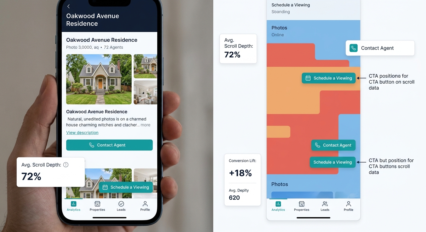
Heat mapping and scroll-depth analytics from real estate sites confirmed what the A/B tests suggested. On mobile listing pages, the average scroll depth sits between 55% and 65% of total page length. For a typical listing page running 3,500 pixels of content on a phone, that means the average visitor sees roughly the first 2,000 pixels before leaving.
Any CTA positioned below that 2,000-pixel mark is invisible to roughly half your mobile traffic. This connects directly to how site architecture creates hidden conversion costs before design decisions enter the picture at all.
The fix is straightforward: place your primary CTA in the first 40% of the mobile page layout, use a sticky footer as a secondary CTA for deep scrollers, and ensure both instances meet the 48×48 pixel minimum with 16px padding. Sites that implement this dual-placement approach consistently outperform single-CTA layouts in real estate conversion rate optimization on mobile.
What The Data Looks Like Today
The current state of mobile CTA placement for real estate has settled into a clear hierarchy backed by test data from multiple sources: position first, size and spacing second, copy third, visual design fourth.
Agents running sites on kvCORE, Sierra Interactive, Real Geeks, or similar platforms should audit three things in order:
- Primary CTA visibility: Is a lead-capture button visible within the first 40% of your mobile listing page without scrolling?
- Sticky secondary CTA: Does a persistent footer bar keep a tap target available during deep scrolls?
- Tap target dimensions: Do all CTA buttons measure at least 48×48 pixels with 16px surrounding padding on actual phone screens?
If any of those three answers is “no,” fixing placement and sizing will generate more additional leads than any design refresh. Optibase’s analysis of A/B testing on CTA buttons confirms that the three priority areas for optimization are mobile usability, accessibility, and strategic testing, with visual design treatments ranking below all three.
Agents losing leads to missed response timing are often fighting a two-stage problem: CTA placement suppresses lead volume upstream, and then slow follow-up kills whatever leads do trickle through. Fixing placement addresses the bottleneck that comes first.
The real estate industry spent years treating CTA buttons as a design problem. Color palettes got debated in team meetings. Border radii got A/B tested. Gradient overlays got refined across template versions. And the entire time, the single biggest factor in whether a mobile visitor became a lead was whether they ever saw the button at all. The research on that point has become hard to argue with. Position the button where your visitors actually are on the page, size it for thumbs, and the design details become a secondary optimization you can fine-tune after the leads start flowing.