

Three filter architectures dominate mobile real estate search: collapsed sidebars, bottom-sheet modals, and persistent chip bars. With 53% of users abandoning any site that loads in more than 3 seconds, the filter pattern your site uses directly determines how many buyers complete the path from search to lead form.
TL;DR: Most agent websites still use desktop-adapted sidebar filters on mobile, forcing buyers through 7-9 taps before seeing a single filtered result. Bottom-sheet modals and persistent chip bars each solve this differently, with distinct tradeoffs in conversion rate, development cost, and thumb-zone usability. Pick the wrong one for your listing volume and you lose leads before they ever reach a contact form.
The filter UI on your property search page is the first decision point every mobile buyer encounters. Before they see a listing photo, before they read a description, before they tap a CTA, they’re telling you what they want through the filters. If that interaction is clumsy or confusing, they leave. As the editorial team at TheFincH Design stated, “UX design is a direct driver of buyer conversion, not a cosmetic consideration.” Their framework breaks the buyer experience into Discovery, Evaluation, and Decision phases, and most agent sites fumble filter design right at the Discovery stage.
So which of the three architectures should your site use? Here are the options, with honest tradeoffs for each.
The Collapsed Sidebar Costs You the Most Taps
The collapsed sidebar is the default on most real estate website builders. It takes the desktop filter panel (price range, bedrooms, bathrooms, property type, square footage) and hides it behind a hamburger icon or “Filters” button on mobile. Buyers tap the button, a panel slides in from the side, they scroll through options, make selections, tap “Apply,” and the panel closes to reveal results.
The core problem is tap count. A buyer searching for a 3-bedroom home under $450,000 in a specific zip code needs to: tap the filter button (1), scroll to price range (2), adjust the minimum slider (3), adjust the maximum slider (4), scroll to bedrooms (5), select 3+ (6), scroll to location (7), enter the zip code (8), and tap apply (9). That’s 9 interactions minimum before seeing a single listing.
The LogRocket UX team’s analysis of mobile filter patterns flags a common design error: price sliders that move in $1 increments instead of $10,000 increments for real estate. When a buyer drags a slider across a $50,000 to $1,000,000 range on a 375-pixel-wide screen, the frustration is immediate. Many abandon the slider entirely, searching without a price filter, which floods them with irrelevant results and accelerates bounce rates.
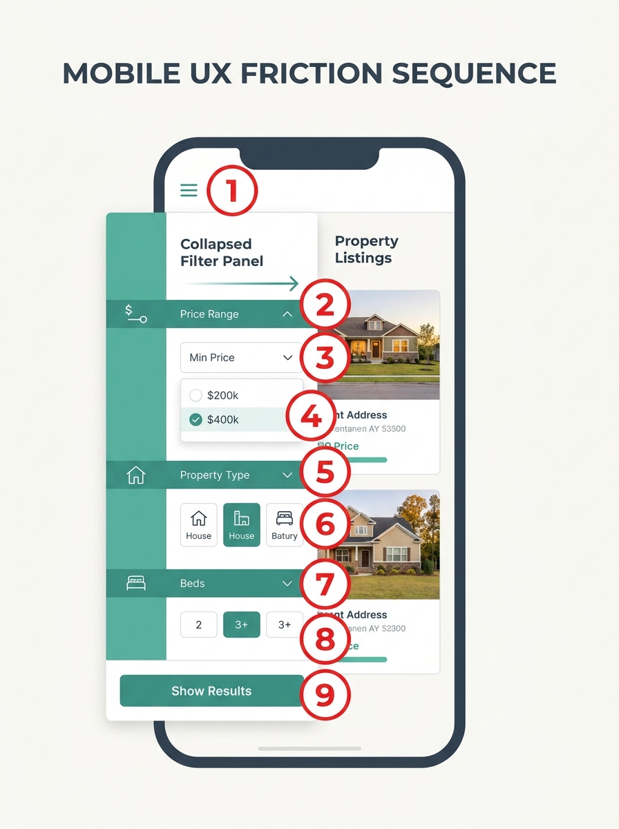
Collapsed sidebars also consume 100% of the viewport when open. Buyers lose visual context of the listings behind them and can’t see results updating in real time as they adjust filters. This removes the feedback loop that keeps people engaged with the search. If your site runs a collapsed sidebar and mobile conversion sits below 1%, filter hierarchy conversion is a likely culprit. The architecture itself creates friction at every step, and when you factor in what delayed or difficult interactions cost agents in missed leads, a 9-tap filter process becomes a serious revenue drain.
Bottom-Sheet Modals Match How People Actually Hold Their Phones
Bottom-sheet modals slide up from the bottom of the screen, covering 60-75% of the viewport. Zillow, Airbnb, and Google Maps all use this pattern. The buyer taps a filter category (like “Price” or “Beds”), the bottom sheet rises with only that category’s options, they make a selection, and the sheet collapses. Total interaction: 3-4 taps to reach filtered results instead of 9.
Why does this work better for mobile real estate search filters? Three structural reasons.
Thumb-zone alignment. On phones held one-handed (which is how most people browse listings during commutes, lunch breaks, or while watching TV), the bottom 40% of the screen is the easiest area to reach. Bottom sheets place interactive elements exactly there. Google’s Material Design guidelines specify minimum touch targets of 48×48 density-independent pixels, and bottom sheets naturally accommodate those targets because they aren’t cramming 12 filter options into a narrow sidebar.
Progressive disclosure. Instead of showing all 8-10 filter categories at once, a well-built bottom sheet presents the 3 most-used filters (price, beds, location) as surface-level options, with an expandable “More Filters” toggle for secondary criteria like lot size, HOA fees, or year built. This reduces cognitive load and speeds up the path to results.
Real-time result previews. Many bottom-sheet implementations show a count (“247 homes match”) that updates live as filters change, giving buyers instant feedback without requiring them to close the panel. This tight feedback loop is what separates high-converting mobile search from the kind that bleeds visitors.
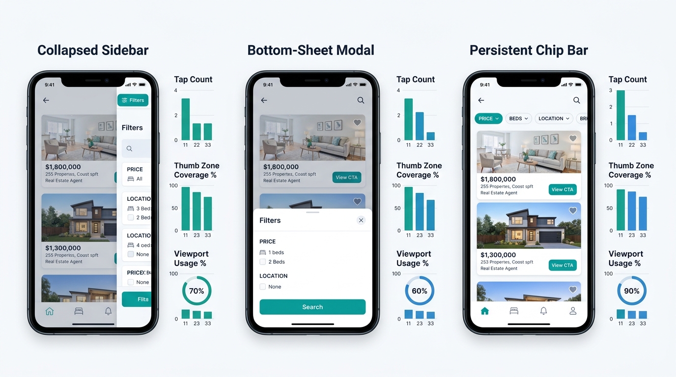
Building a touch-friendly UX for real estate agents means respecting how people physically interact with their phones, and bottom sheets do that by default. The tradeoff is development complexity. If you’re using a basic website builder, you likely can’t implement a custom bottom-sheet filter without developer help. When calculating the true cost of your website builder, factor in whether it supports this interaction pattern natively or whether you’ll pay $2,000-$5,000 in custom development to get it.
Persistent Chip Bars Keep Filters Visible Without Stealing Screen Space
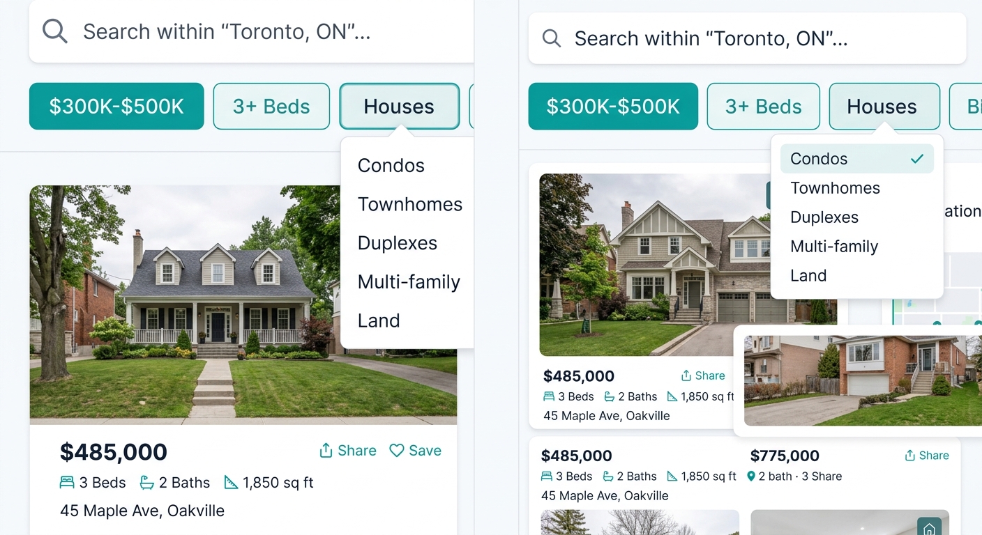
The third approach places small, tappable filter chips in a horizontally scrollable bar pinned below the search header. Think of how Google Search results show “Tools,” “Price,” and “Nearby” as small pills you can tap to toggle. On a property search page, these chips might read “$300K–$500K,” “3+ Beds,” and “Houses,” remaining visible as buyers scroll through listings.
The advantage is zero-state friction. Buyers see active filters at all times. Tapping a chip opens a small dropdown for that single category. Tapping the X on a chip removes the filter. The entire interaction stays within 2-3 taps, and listings remain visible throughout. For property listing navigation optimization, this architecture surfaces what matters without hiding it behind a button.
A 9-tap filter process on mobile is a revenue problem disguised as a design choice.
The downside is screen real estate. The chip bar typically occupies 44-48 pixels of vertical space, which on a 667-pixel viewport (iPhone SE) represents about 7% of the screen. On larger phones (812+ pixel viewports), this tradeoff becomes negligible, but on smaller devices it compresses the content area noticeably. There’s also a filter-count ceiling: chip bars work well with 4-6 active filters, but beyond that, horizontal scrolling becomes unwieldy and buyers miss criteria hidden at the scroll’s end.
If your MLS integration requires 10+ filter categories, chips alone won’t cut it. You’ll need primary filters as chips with a “More” button that opens a bottom sheet for secondary criteria, creating a hybrid approach. And if you’ve already optimized your CTA button positioning on mobile listing pages, plan the vertical stacking carefully so buyers don’t face a screen where 20%+ of the viewport is occupied by fixed UI elements.
The Comparison at a Glance
| Attribute | Collapsed Sidebar | Bottom-Sheet Modal | Persistent Chip Bar |
|---|---|---|---|
| Taps to first filtered result | 7-9 | 3-4 | 2-3 |
| Thumb-zone alignment | Poor (full-screen panel) | Strong (bottom 40%) | Moderate (top-fixed bar) |
| Real-time result preview | Rarely supported | Usually supported | Always visible |
| Filter visibility while browsing | Hidden | Hidden until tapped | Always visible |
| Development complexity | Low (most builders default) | Medium-High | Medium |
| Best for listing volumes of | Any (but worst UX) | 50+ listings | 20-200 listings |
| Screen space consumed when active | 100% of viewport | 60-75% of viewport | 7% of viewport |
Tip: If your current site uses a collapsed sidebar, check your analytics for the drop-off rate between the search page and individual listing views. A gap above 60% suggests the filter interaction itself is pushing buyers out before they see any properties.
How To Choose Between These Three
Your listing volume and your tech stack should drive this decision, not visual preference.
If you operate in a market with fewer than 50 active listings and your site runs on a standard builder with limited customization, persistent chip bars with 3-4 filter categories give buyers the fastest path to results. The tap count stays at 2-3, the filters stay visible, and you don’t need custom development. Platforms like Pillar already account for mobile-first filter logic in their property search architecture, removing much of the guesswork.
If you’re covering a larger market with hundreds of listings across multiple property types, price bands, and neighborhoods, the bottom-sheet modal handles that complexity without overwhelming the screen. It’s the architecture every major property portal uses for a reason: it scales. But you’ll need a developer or a platform with native support for that interaction model.
If your site currently uses a collapsed sidebar (and statistically, it probably does), don’t tweak the styling. The core interaction model is the problem. Reducing mobile lead loss in real estate starts with cutting the taps between a buyer’s intent and their first filtered result. Switching from 9 taps to 3 will improve your conversion rate more than any color change, font swap, or hero image redesign. Once the filter gets out of the way, a well-structured property page behind it can actually do its job of capturing the lead. Until then, the buyer never makes it that far.