

Every real estate website template ships with the same default navigation: Home, About, Listings, Blog, Contact. That five-tab hierarchy determines where 68% of mobile visitors land, what they see next, and whether they ever reach a lead capture form, according to mobile search data published by RealScout. Site structure controls conversion before a single design choice gets made.
The Five-Tab Template and Its Routing Problem
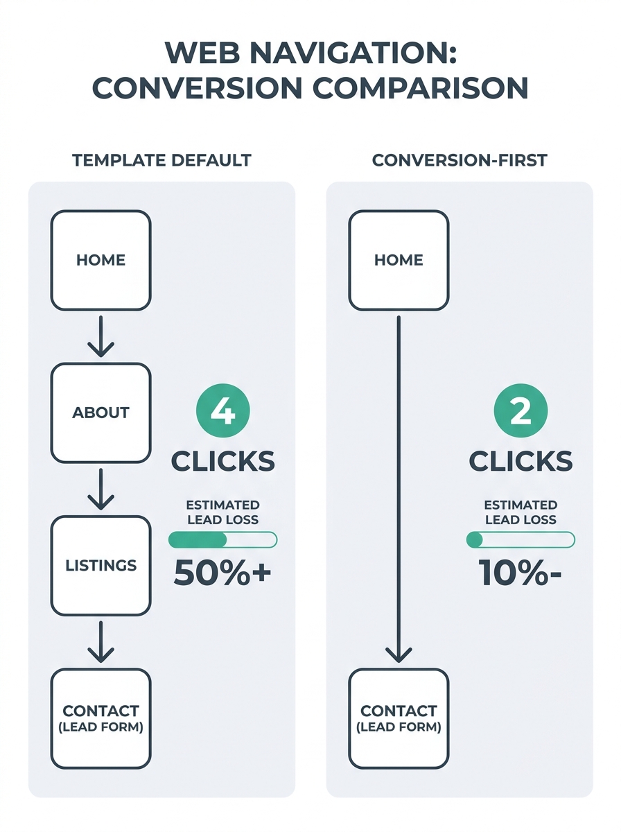
The standard real estate website template arranges information around what looks logical to the agent who builds it. Home at the top. About page second. Listings third. Blog fourth. Contact fifth. This structure reflects how the agent thinks about their business, not how a buyer or seller moves toward a conversion event.
Sierra Interactive’s conversion optimization documentation identifies the core issue directly: sites need to simplify navigation, use clear CTAs, and showcase social proof through lead magnets like market reports at every stage of the visitor’s path. The default five-tab template does the opposite. It puts the agent’s biography ahead of the property search. It buries market reports inside blog archives. And it routes every visitor through the same linear path regardless of whether they’re a first-time buyer researching mortgage basics or a seller comparing agents.
This is the conversion tax. Before anyone evaluates your headshot, logo, or color scheme, the navigation hierarchy has already decided how many clicks separate a visitor from a lead capture form. On most template-based agent sites, that distance is 3-4 clicks. Each additional click between landing and conversion bleeds leads at every stage of the funnel.
Three Dead-End Paths Built Into the Standard Hierarchy
The template navigation hierarchy creates three specific structural dead ends that kill property site structure conversion before design enters the picture.
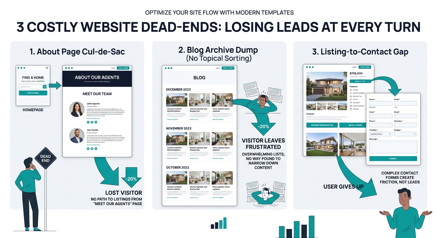
The About Page Trap. When “About” sits in the second navigation position, it becomes one of the top 3 most-visited pages on the site. Visitors click it, read the agent bio, and face a binary choice: click “Contact” (a high-commitment action for someone still in the awareness stage) or hit the back button. There’s no intermediate conversion pathway, no market report download, no saved search signup. The About page becomes a cul-de-sac where visitors arrive curious and leave unconverted.
The Blog Archive Dump. Template blog sections display posts in reverse chronological order with no topical organization. A seller researching home valuations sees the same undifferentiated feed as a buyer looking at school districts. Geekly Media’s CRO research makes this explicit: visitors need to find answers to their questions and navigate easily through landing pages and navigation bars. A chronological blog archive achieves neither goal. It’s a content graveyard where useful guides go to be buried under newer, less relevant posts.
The Listings-to-Contact Gap. The third dead end sits between the Listings page and the Contact page. A visitor finds a property they like. They want more information. The template offers two options: a generic contact form or a phone number. There’s no listing-specific inquiry form, no option to schedule a showing for that property, no neighborhood guide for that ZIP code. The structural gap between “I’m interested in this house” and “I want to talk to an agent” is where leads evaporate most reliably.
RealScout’s published guidance captures the underlying principle: “Build for strategic conversion, not engagement. Rather than trying to keep visitors searching on your site, design clear pathways that convert them into leads with targeted content and compelling calls to action.” The template navigation hierarchy does the opposite. It optimizes for browsing duration, not conversion events.
The Awareness-to-Decision Mismatch
The structural problem runs deeper than individual page layouts. Sierra Interactive’s buyer journey documentation maps three distinct stages: a potential buyer starts by researching general home-buying information (awareness), then compares properties and financing options (consideration), and finally chooses a specific home to purchase (decision). Each stage demands different content, different calls to action, and different levels of commitment in lead capture forms.
The five-tab template treats all three stages identically. An awareness-stage visitor researching “what does a buyer’s agent do” lands on a blog post and sees the same navigation as a decision-stage buyer who searched for a specific MLS listing number. Both visitors encounter the same site hierarchy, the same CTAs, the same contact form fields. The awareness visitor isn’t ready to share their phone number and full name. The decision visitor doesn’t want to read a beginner’s guide to homebuying. Template limitations conversion becomes visible at this exact point: the structure can’t differentiate between visitor intents because it was built with a single navigation path.
This is where agents who’ve gone through a lead magnet architecture audit start to see the gap. The forms aren’t buried because of poor design. They’re buried because the navigation hierarchy has no mechanism to route different visitor intents to different conversion pathways. A market report download belongs on awareness-stage pages. A showing scheduler belongs on listing pages. A seller consultation request belongs on valuation-related pages. The template stacks all of these behind a single “Contact” tab.
The navigation hierarchy has no mechanism to route different visitor intents to different conversion pathways. That’s the conversion tax.
68% Mobile Traffic Meets a Desktop Navigation Hierarchy
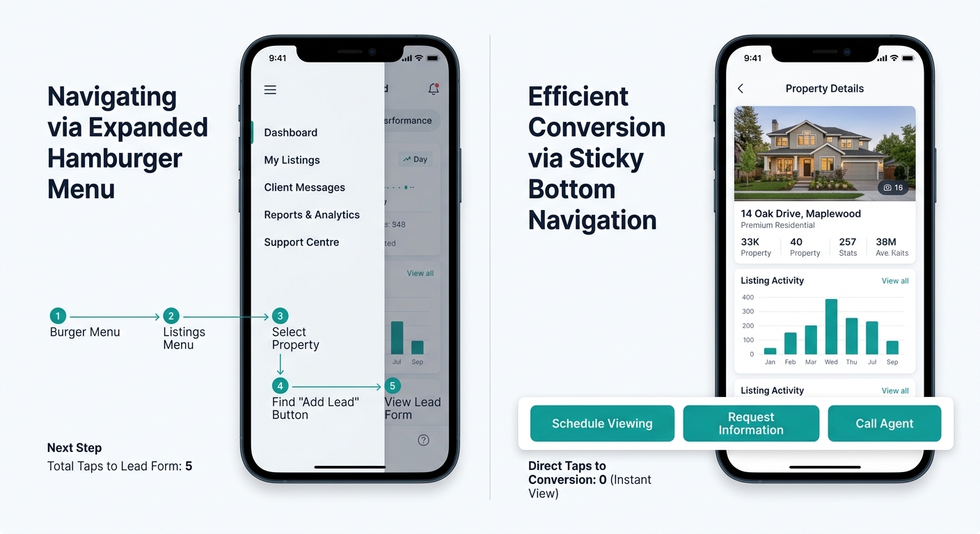
The structural damage compounds on mobile devices. With 68% of real estate searches starting on phones, according to RealScout’s published data, the five-tab desktop navigation collapses into a hamburger menu. And that hamburger menu preserves the same flawed hierarchy in a format that requires even more taps to navigate.
On desktop, the five tabs are at least visible simultaneously. A visitor can scan all options and self-select. On mobile, those five options hide behind a three-line icon that 30-40% of mobile users don’t tap at all. The visitors who do tap it encounter the same linear sequence: Home, About, Listings, Blog, Contact. Each tap inside the hamburger menu loads a new page, and each new page load on mobile takes 2-4 seconds on average cellular connections.
The math is punishing. A mobile visitor who arrives from a Google search, taps the hamburger menu, navigates to Listings, finds a property, then tries to contact the agent has executed 4-5 taps across 3-4 page loads. At typical mobile bounce rates, roughly 40-50% of visitors abandon by the second page load. The site hierarchy SEO leads relationship breaks down here, too: Google’s crawlers evaluate the pages that visitors actually reach and engage with, and pages buried 3+ clicks deep from the homepage receive less crawl priority and less ranking weight.
This is the same mobile-first architecture problem we’ve covered in detail when examining how filter logic affects lead capture on phones. The issue repeats across the entire site structure, not just the search filters. And it explains why agents who spend $3,000-$5,000 on a redesign often see no improvement in lead volume. The new design sits on top of the same broken hierarchy.
Warning: Redesigning your site’s visual appearance without restructuring the navigation hierarchy is the most expensive mistake agents make. You’re paying to repaint a house with a broken floor plan.
After the Rebuild: Same Pages, Different Conversion Rate
The fix doesn’t require new content, a new platform, or a new domain. It requires rearranging what already exists based on how visitors actually move toward conversion events.
The agents who resolve this conversion tax tend to make 3 structural changes. First, they replace the five-tab linear navigation with an intent-based hierarchy that separates buyer paths from seller paths at the first click. “Buy” and “Sell” replace “Listings” and “About” as primary navigation items. The About page moves to a footer link or becomes a sub-page.
Second, they restructure the blog from a chronological archive into topical content hubs: a first-time buyer guide, a seller preparation checklist, a neighborhood resource center. Each hub has its own lead magnet matched to the visitor’s intent stage. The awareness hub offers a downloadable market report. The consideration hub offers a property comparison tool. The decision hub offers a showing scheduler.
Third, they reduce click depth for lead capture forms. Every property listing page includes a listing-specific inquiry form (not a generic “Contact Us”). Every blog post includes a contextual CTA matched to the post’s topic. Every page on the site is no more than 2 clicks from a conversion event. If you’re evaluating which website builder balances speed against customization, this restructuring capability should be your primary selection criterion, not design template variety.
The conversion tax that template navigation hierarchy creates is invisible in analytics dashboards because agents track design metrics (bounce rate, time on site, page views) rather than structural metrics (click depth to conversion, navigation path completion rate, intent-stage matching accuracy). And because the tax is invisible, agents keep paying it. They redesign. They add new photos. They change their headshot. The leads don’t improve, and the navigation hierarchy that caused the problem survives another $5,000 website refresh untouched.