
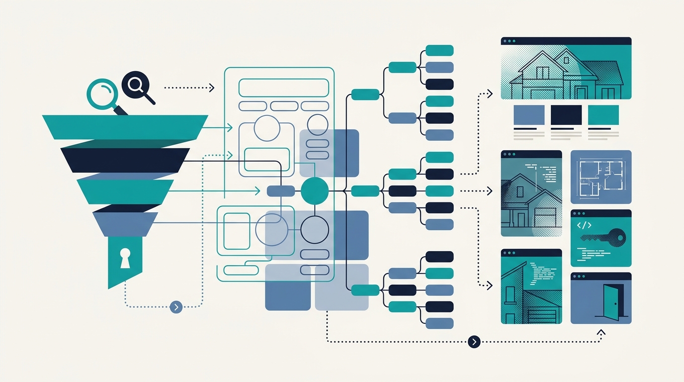
Every real estate website has a search bar, a listings page, and a contact form. The arrangement of those three elements, and the pages sitting between them, determines whether a visitor registers as a qualified lead or exits to Zillow within 8 seconds. Your real estate website architecture is the lead magnet itself, not something you bolt onto it afterward.
Why One Navigation Path Costs You the Best Leads
A 2026 Slamdot conversion analysis found that 90% of real estate websites say the same exact things and follow an identical structural pattern: homepage hero image, a search widget, an “About” section, and a contact form stuck at the bottom. The result is a property site navigation structure that treats every visitor identically, whether they’re a first-time buyer Googling “best neighborhoods in Austin” or a relocating executive who already has pre-approval and needs to schedule three showings this weekend. Both visitors get the same page, the same links, the same 7-field contact form.
That structural sameness creates a specific, measurable problem. E-closion’s 2026 analysis of the real estate buyer digital journey identifies distinct online phases that homebuyers move through: awareness (researching neighborhoods and market conditions), consideration (comparing specific listings and agents), and decision (scheduling tours, requesting disclosures, making offers). Each phase carries different information needs, different trust thresholds, and different conversion readiness levels. A site that funnels all three visitor types through the same navigation path forces high-intent buyers to wade through content designed for browsers, and forces browsers to encounter conversion pressure they’re not ready for. According to Codedesign’s customer journey mapping research, “a homebuyer starts by Googling ‘best neighborhoods to invest,’ lands on multiple aggregator sites, and peruses various agents’ listings” before narrowing to a single brand, and each of those touchpoints requires different page structure to convert.
The Unicorn Platform’s 2026 framework for conversion pages demonstrates what intent routing looks like in practice. Their approach splits visitors immediately: “I am a property owner” triggers a consultation-oriented flow, while “I am a tenant” triggers a service-request flow. Each path gets its own CTA hierarchy, proof emphasis, and form fields. Apply the same logic to buyer-facing real estate sites and you get 3 distinct entry corridors instead of 1 generic funnel. A first-time buyer clicking “Explore Neighborhoods” lands in a content hub with school district data, walkability scores, and median price trends. A buyer clicking “Schedule a Showing” hits a stripped-down form with available time slots and zero friction between intent and action.
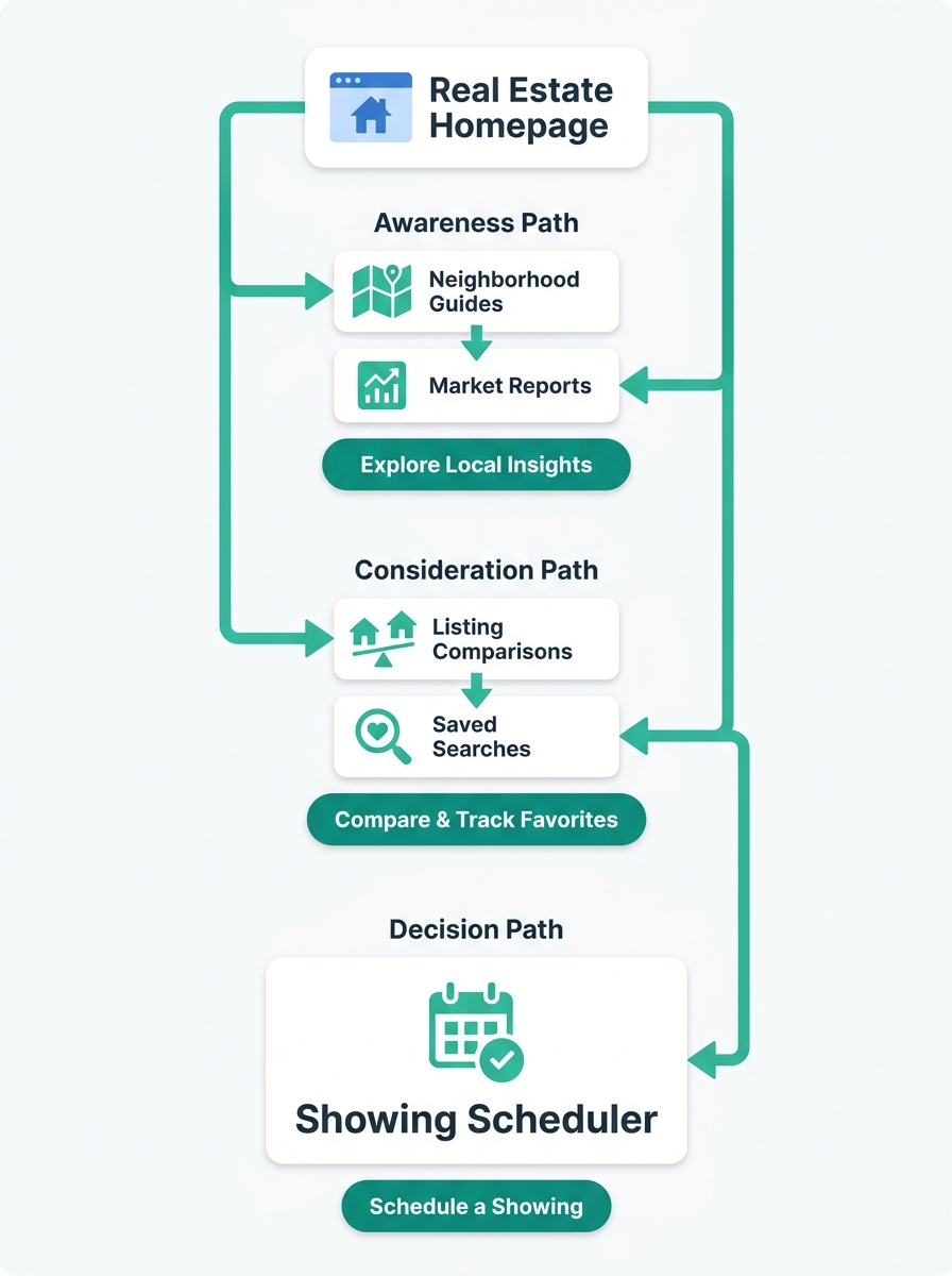
This is where buyer journey mapping stops being a marketing abstraction and becomes a structural exercise. You’re deciding which pages link to which other pages, what content sits above the fold on each template, and where forms appear based on the visitor’s demonstrated intent. The page hierarchy is the strategy.
Turning Page Templates Into Intent Filters
The practical difference between a generic real estate site and one built around intent matching comes down to 3 template decisions: what your neighborhood pages contain, how your listing detail pages are structured, and where your lead capture information design lives relative to the content a visitor actually came to read.
Neighborhood pages are your awareness-stage workhorses. RealScout’s lead generation research describes a content architecture that compounds over time by combining a local YouTube channel (neighborhood tours, market updates, buyer and seller FAQs) with a blog targeting phrases like “homes for sale in [city]” and “moving to [city].” The critical structural decision is placing these pages within your site hierarchy as genuine content hubs with internal links to relevant listings, not as orphaned blog posts floating disconnected from your property database. When you consider how information architecture drives more conversions than design polish, the connecting tissue between content and listings is where most of the value lives. Agents who build 15-20 interlinked neighborhood pages with embedded listing feeds see 40-60% more organic search traffic to their property pages than agents who publish the same number of standalone blog posts with no structural connections.
Listing detail pages serve your consideration-stage visitors. These visitors already know the neighborhood. They want square footage, lot size, HOA fees, tax history, and high-resolution photos arranged in a specific visual hierarchy. The lead capture mechanism on these pages should match that intent: “Get price drop alerts for this listing” or “Request the seller’s disclosure” rather than a generic “Contact us” button that gives the visitor no reason to hand over their email. As Quixsites’ conversion planning guide puts it, effective conversion is “the strategic process of designing every element of your site to turn visitors into qualified leads.” Every element, not a single contact form nailed to the footer.
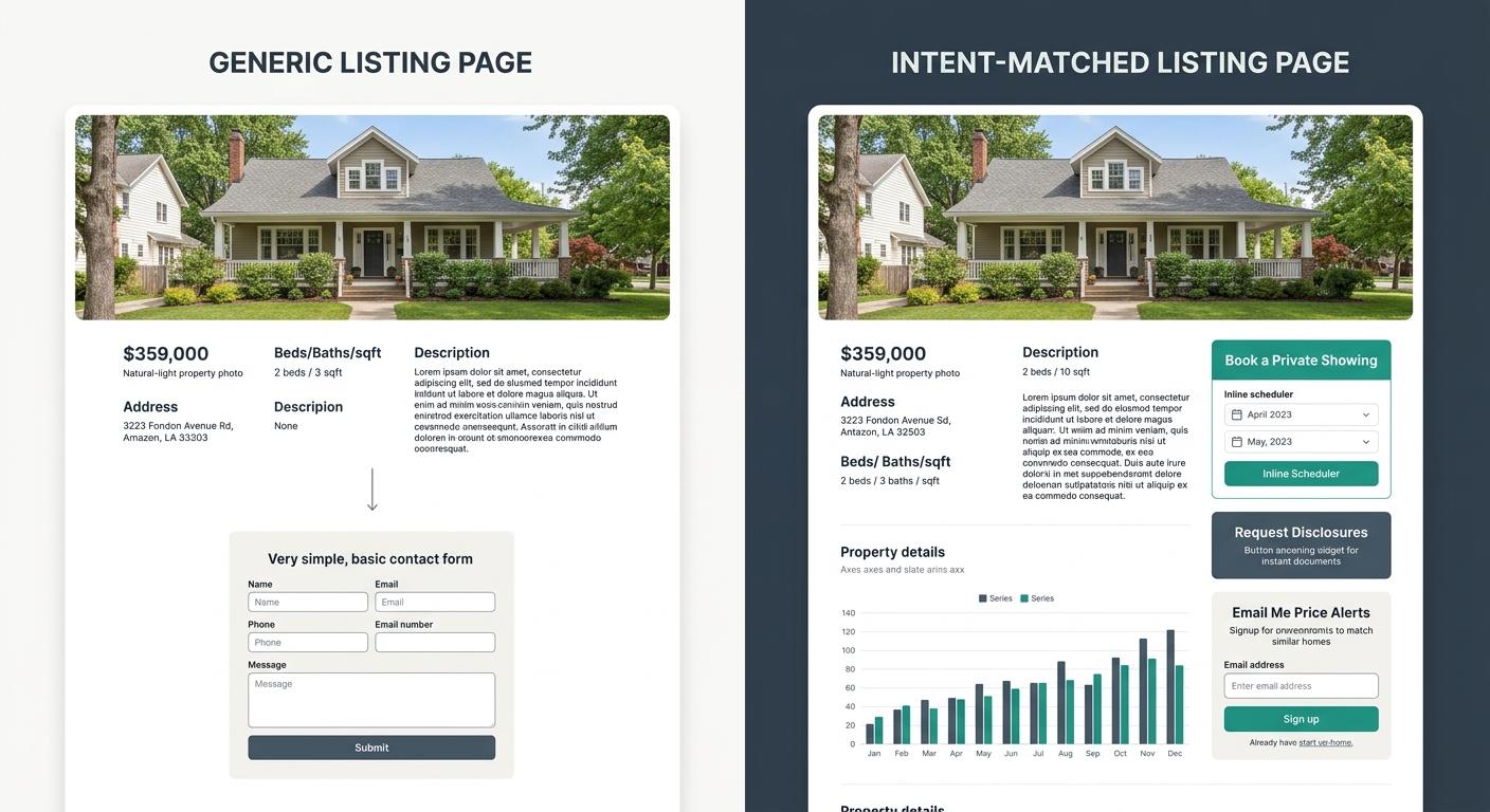
Your decision-stage pages need the least content and the most speed. Showing schedulers, offer submission portals, and agent direct-contact pages should load in under 3 seconds and score above 90 on Core Web Vitals assessments. These pages should strip away global navigation, sidebar widgets, and footer links that give a ready-to-act buyer 12 other places to click instead of completing the one action they came to take. The landing page principle from Muffin Group’s design analysis applies here: effective landing pages “strip away navigation menus, sidebars, and other distractions to focus entirely on conversion” with a single call-to-action button and targeted messaging. Your decision-stage property pages should follow the same discipline.
Lead Capture Information Design Across the Funnel
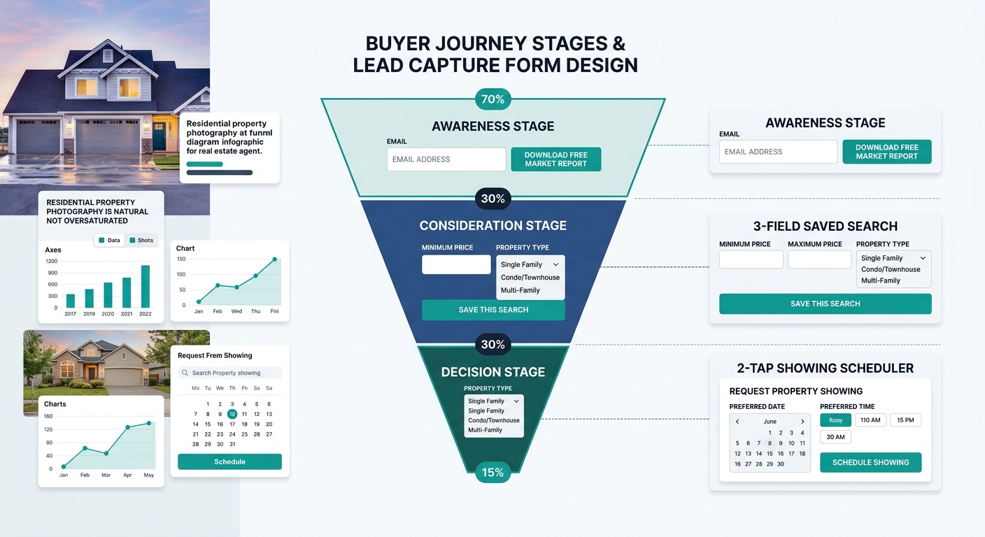
The form a visitor encounters should vary based on where they entered your site and what content they consumed before reaching it. Sierra Interactive’s optimization guidance recommends using “lead magnets like market reports or alerts” for early-stage visitors, and the logic extends to form design at every stage. A visitor who downloads a neighborhood guide through a 1-field email form is telling you exactly where they want to buy before you ever speak to them. That location signal is worth far more than a cold registration from a generic “Sign Up” form that captures an email address with zero context.
Consideration-stage capture should tie directly to the listing or set of listings the visitor is browsing. Saved search alerts, price change notifications, and “Similar homes” email digests all convert at higher rates than generic newsletter signups because they match the visitor’s demonstrated interest. The form fields at this stage can expand to include timeline (“When are you looking to buy?”), financing status (“Are you pre-approved?”), and property preferences (“Must-haves?”), because the visitor has already shown enough engagement to justify a 3-field form rather than a 1-field form. Direction.com’s broker guide to conversion optimization emphasizes creating “a clear path to conversion by strategically placing calls-to-action and links to key pages” throughout the site rather than relying on a single conversion point.
The architecture of your site does the qualification work before the lead ever reaches your inbox.
Decision-stage capture barely looks like a form at all. It’s a showing scheduler with 2 taps to complete, a “Request to make an offer” button, or a direct phone number with click-to-call functionality. The visitor at this stage doesn’t need nurturing. They need to be connected to an agent within minutes. If your site makes a ready buyer fill out the same 7-field contact form that a casual browser encounters, you’re adding friction at the exact moment when speed determines whether you get the client or your competitor does. When you think about how mobile navigation design affects lead capture rates, the decision-stage visitor on a phone is the person most likely to abandon if the conversion path requires scrolling past content they’ve already seen.
This staged approach means your CRM receives leads pre-sorted by intent level. An agent receiving a showing request from a pre-approved buyer treats that contact differently than an email captured through a neighborhood guide download. When you build your first property website with this structure from day one, every lead arrives with behavioral context attached, and your follow-up sequences can match.
Where This Argument Hits Its Limits
The case for intent-matched real estate website architecture is backed by solid conversion logic and by the data from sites that implement it well. But there’s an honest tension this framework doesn’t fully resolve. Building 3 distinct navigation paths with unique templates, capture forms, and content strategies requires ongoing content production that most solo agents and small 2-3 person teams can’t sustain month after month. A site architecture designed for buyer journey mapping is only as good as the content filling it. An empty neighborhood hub with 2 blog posts and no embedded listings undermines the entire structure, and a half-built intent path may actually perform worse than a simple, well-maintained single-path site.
There’s also the question of whether buyers actually follow the linear awareness-to-decision path that this framework assumes. E-closion’s buyer journey research acknowledges that the modern buyer’s path is rarely linear, with visitors jumping between comparison and decision stages, revisiting neighborhood research after touring homes, and circling back to awareness-stage content weeks after their first visit. A rigid site architecture that assumes a clean funnel may force visitors into paths that don’t match their actual behavior. The practical answer is probably to build for the 3 stages while allowing easy cross-navigation between them, which partially contradicts the “strip away distractions” advice for decision-stage pages. Getting this balance right depends on your market, your team size, and how many active listings you’re marketing at any given time. The architecture gives you a starting point. Watching where visitors actually go, versus where you expected them to go, is the part that never stops.