

Schema.org’s RealEstateListing markup identifies five core fields that search engines expect on every property page: bedroom count, bathroom count, floor size, address, and year built. That structured data standard mirrors what buyers scan for first, and it gives you a blueprint for how to stack property details on your website from top to bottom.
TL;DR: Buyers process listing pages in a predictable order: price and photos first, then bed/bath/square footage, then secondary details like year built and lot size. Aligning your page layout to this hierarchy keeps the highest-value information above the fold and moves visitors toward contact forms faster.
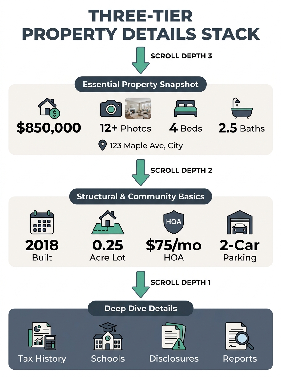
The Five-Three-Two Detail Stack
The research on high-converting property listing pages points to a consistent pattern: users link page speed and information clarity to professionalism and reliability. When property details are organized poorly, visitors don’t dig for what they need. They leave. A clear real estate website information hierarchy prevents that exit by front-loading the details buyers care about most.
Here’s the framework, broken into three tiers based on buyer search behavior and the structured data fields search engines already prioritize:
Tier 1 (above the fold): Price, hero photo gallery, bedrooms, bathrooms, square footage, full address
Tier 2 (first scroll): Year built, lot size, property type, HOA fees, garage/parking, heating/cooling
Tier 3 (deep scroll): Tax assessment history, school district assignments, utility providers, legal disclosures, flood zone status
This isn’t arbitrary. The five schema fields that Google parses for rich results (numberOfBedrooms, numberOfBathroomsTotal, floorSize, address, yearBuilt) map directly to Tiers 1 and 2. Your page layout should respect the same priority that search engines have already validated through structured data requirements.
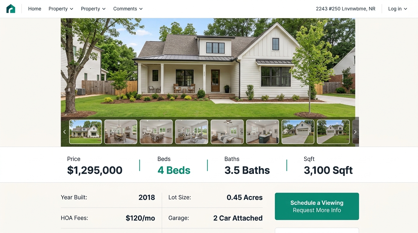
Price and Photos Anchor Everything
The NAR’s Profile of Home Buyers and Sellers reports that 95% of home buyers use the internet to search for homes. For those buyers, the listing page is the first real interaction with a property. The price and the lead photo are what they came for.
Forbes Advisor’s analysis of real estate website design confirms this: hierarchical grids that give critical information the most screen space draw visitor attention to your biggest offerings. On a listing page, that means the hero image and price tag should command the top 60-70% of the visible viewport on desktop.
Place the price in large, high-contrast type directly adjacent to or overlaid on the hero image. Bedroom count, bathroom count, and square footage belong in a single horizontal row immediately beneath the photo, using icon-label pairs (a bed icon with “4 BD,” a tub icon with “3 BA,” a ruler icon with “2,400 sqft”). This horizontal row works because it communicates three data points in under two seconds of reading time.
If you’ve audited your image gallery’s impact on conversion, you already know that photo optimization matters as much as photo placement. Lazy loading and proper compression prevent the layout from slowing down, and users interpret slow pages as unprofessional. The connection between speed and trust runs deep in buyer search behavior.
Tip: Test your listing page load time with photos enabled versus disabled. If the difference exceeds 1.5 seconds, your images need compression or a CDN. Your [site speed benchmarks](/blog/real-estate-website-speed-core-web-vitals) directly affect whether buyers stay long enough to see your Tier 1 details.
The First Scroll Carries the Decision-Makers
Tier 2 details are where serious buyers separate from casual browsers. Year built, lot dimensions, HOA monthly fees, and parking count answer the questions that move someone from “interested” to “I want to schedule a showing.”
The property attribute placement for these mid-page details works best in a two-column grid or a simple data table:
| Detail | Format | Why It Matters at This Position |
|---|---|---|
| Year built | Four-digit year | Signals renovation needs, insurance costs |
| Lot size | Acres or square feet | Critical for families, pet owners, hobby gardeners |
| HOA fees | Monthly dollar amount | Affects affordability calculation immediately |
| Garage/parking | Count + type (attached, detached) | Deal-breaker for multi-car households |
| Heating/cooling | System type | Impacts utility cost estimates |
Place this grid immediately after the photo gallery ends. The scroll from gallery to data table should feel continuous, with no interstitial ads, agent bio blocks, or promotional banners breaking the flow. Buyers who scroll past the photos are actively evaluating the property. Interrupting that evaluation with self-promotional content kills the momentum that drives lead conversion.
Where the Contact CTA Belongs in the Stack
CallAction’s research on buyer intent found that searches for “call listing agent” reflect urgency from active buyers who want immediate property details and showing access. These buyers aren’t browsing. They’ve already decided to act and are looking for the fastest path to a conversation.
Your contact CTA placement needs to respect this urgency. The conversion-optimized listing layout places a sticky contact element (phone number, short form, or “Schedule a Showing” button) visible at all scroll depths, but the primary CTA block should sit between Tier 2 and Tier 3 content. By that point, a buyer has seen the photos, confirmed the price and dimensions, reviewed the secondary details, and is ready to take the next step.
The agents who bury their CTAs at the very bottom of the page, after tax records and flood maps, lose the high-intent visitors who were ready to convert three scroll-lengths earlier. And the agents who place CTAs before any property details appear lose a different segment entirely: the careful buyers who won’t click “Contact Agent” until they’ve confirmed the property meets their baseline criteria.
Place your primary contact block between Tier 2 and Tier 3 details. Buyers who scroll past lot size and HOA fees have already passed their own internal qualification filter.
The sticky element is separate from this primary block. Keep it small, persistent, and anchored to the bottom of the mobile viewport or the right sidebar on desktop. It catches the buyers who are ready at any scroll position without blocking property details UX for those still evaluating.
Mobile Compresses the Stack and Changes What “Above the Fold” Means
On a 390-pixel-wide phone screen, “above the fold” holds roughly one hero image and three lines of text. That’s your entire Tier 1 viewport. The bed-bath-sqft row needs to be visible without scrolling past the first photo, which means your mobile-first property search architecture determines whether buyers see the most important details or just a cropped photo with a hamburger menu.
AgentFire’s design guidelines recommend breadcrumb navigation showing users their location within the site hierarchy (Home > Communities > Downtown > Listings), and that recommendation becomes more urgent on mobile where screen real estate is scarce. Breadcrumbs give mobile visitors spatial context without consuming the space that Tier 1 data needs.
On mobile listing pages, collapse Tier 2 details into expandable accordion sections rather than a scrolling data grid. Each accordion header should display the detail name and its value (e.g., “Year Built: 1998”) so buyers can scan without tapping. This pattern reduces scroll depth by 40-50% on data-heavy listings and keeps the contact CTA within thumb reach of the fold.
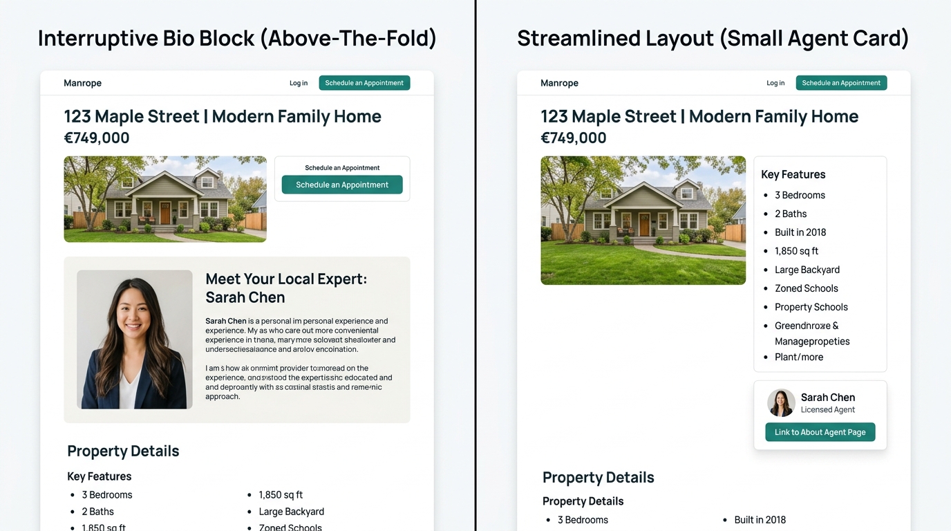
The About Page Signal Most Agents Miss
Forbes Advisor’s research surfaces a finding that deserves more attention: the About page is the second most-visited page on real estate websites. That ranking tells you something important about how buyers navigate property sites. They don’t move linearly from listing to listing. They find a property they like, then immediately check whether the agent behind it is someone they’d trust.
This behavior means your information architecture should create a clear path from any listing page to your About page. A small agent card with photo, name, and a “Learn More” link placed within the Tier 2 section of the listing page serves this purpose without disrupting the property details hierarchy. The agent card is contextual proof of credibility at the exact moment a buyer is evaluating whether to make contact.
What Still Isn’t Settled
The property details hierarchy described here draws on search engine structured data standards, UX research, and buyer intent patterns. But several questions remain open.
Eye-tracking studies on real estate listing pages are sparse. The 95% figure from NAR confirms that buyers search online, but the specific gaze patterns across listing page sections haven’t been published with the granularity that e-commerce product pages have received. If NAR or a major brokerage consortium releases heatmap data for property pages, the Tier 1/2/3 boundaries could shift.
Regional variation is another unknown. Buyers in markets where HOA fees are rare (rural areas, older suburban communities) may process Tier 2 details in a different order than buyers in HOA-heavy condo markets like South Florida or Phoenix metro. The stack described here is a strong default, but testing it against your specific audience’s click and scroll data will produce a version tuned to your market.
And the role of AI-powered property search is evolving quickly. As buyers increasingly ask conversational queries about listings through tools like ChatGPT or Google’s AI Overviews, the details that appear in AI-generated summaries may reshape which features buyers arrive at your site already knowing. That could make Tier 1 details redundant for AI-referred traffic and push Tier 2 and Tier 3 content higher in importance for those visitors. Agents tracking their lead sources and conversion paths should watch for this pattern in their analytics over the next 12 months.