
Agents rebuilding their property inquiry forms generally land on one of three designs: a stripped-down name-and-email box, a multi-step form that reveals fields in stages, or a longer qualifying questionnaire meant to filter out tire-kickers before they ever reach your phone. Each design solves a real problem. Each one also creates a different problem.
The spread in results is dramatic. Landingi’s analysis of real estate landing page benchmarks puts the median conversion rate at 2.6% and the average at 7.4%, meaning the top-performing pages convert nearly three times the leads from identical traffic. The form itself accounts for a huge share of that gap, because it’s the final obstacle between a motivated buyer and your inbox.
So which form structure actually fits your business? That depends on your lead volume, your follow-up capacity, and how much time you can afford to spend qualifying people who were never going to transact. Here’s how each option stacks up when you run a real estate form optimization audit.
The Stripped-Down Form Gets Volume But Drowns You in Noise
The minimal form asks for name, email, phone number, and maybe a dropdown for “I’m interested in buying / selling / renting.” It’s the default on most agent websites. It exists because it works, at least by one narrow measure: submission rate.
A Zillow UX study found that forms with 3 to 5 fields convert up to 37% better than longer, non-targeted forms. That’s a meaningful lift when you’re paying per click on Google Ads or spending hours creating content to drive organic traffic.
The logic is sound. Every additional field you ask a visitor to fill out is a lead capture friction point. People browsing listings on their phone during a lunch break don’t want to type out their timeline, budget range, pre-approval status, and preferred neighborhoods. They want to fire off a quick inquiry and get back to their day.
Where this design falls apart
The volume it generates can be poisonous if you don’t have a system to sort it. When anyone can submit a form in eight seconds, anyone will, including people who are 18 months from buying, people who confused your site with Zillow, and bots. You end up spending your first hour every morning sifting through submissions trying to figure out who’s real.
If your follow-up workflow is already shaky, and the data suggests most agents’ nurture sequences break down somewhere between capture and conversion, a flood of unqualified names makes the problem worse. You’ll respond slower to the serious buyers because they’re buried under noise.
Best fit: Agents or teams running paid campaigns where every lead gets routed into an automated CRM sequence with scoring built in. If you’ve picked a CRM that tags and ranks leads automatically, the minimal form feeds it well. Without that backend, you’re collecting names into a spreadsheet and hoping for the best.
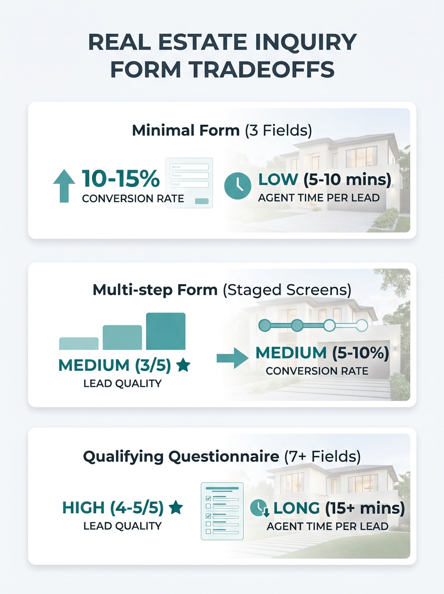
Multi-Step Forms Trade Speed for Engagement
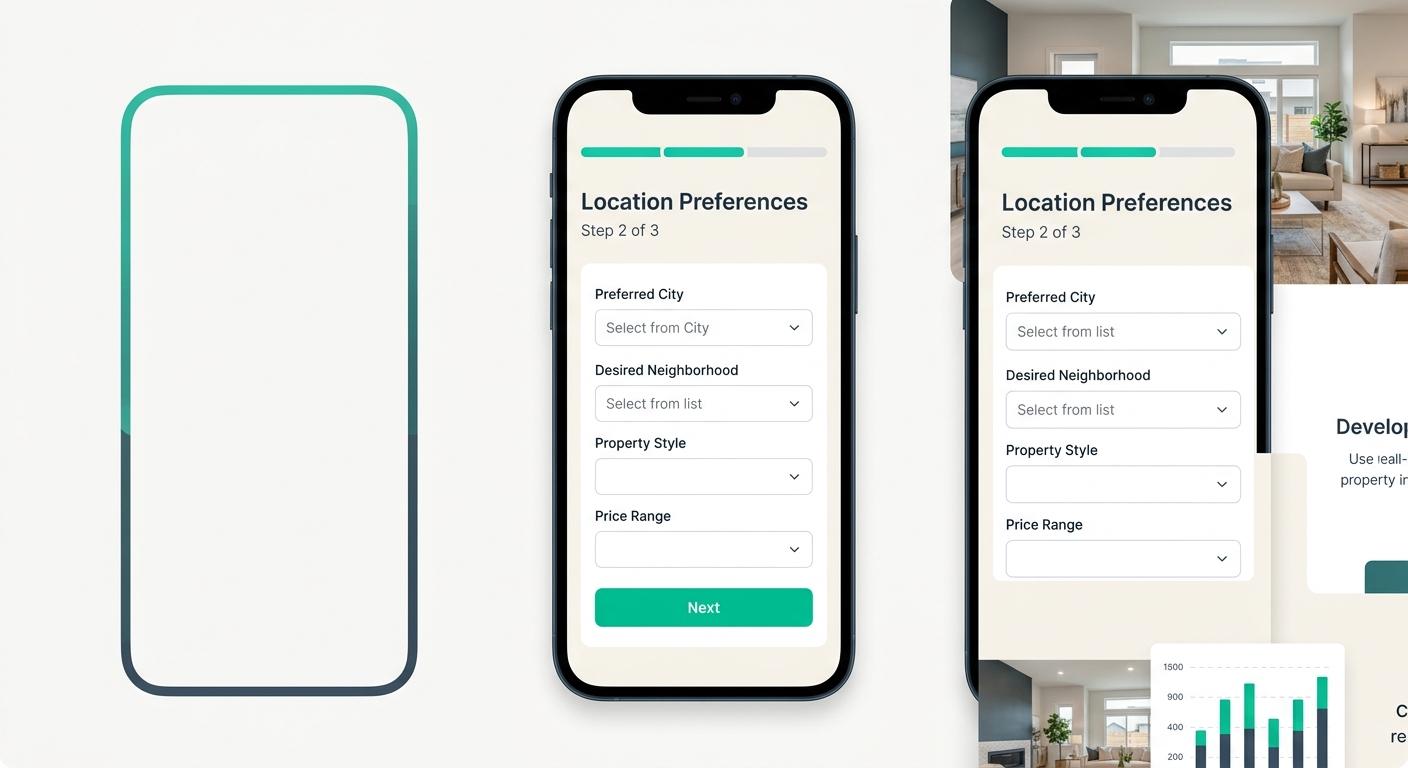
The multi-step form breaks the inquiry into two or three screens. Screen one might ask for property type and location preferences. Screen two collects contact info. Screen three (optional) asks about timeline and budget.
The psychology here is the “foot in the door” effect. Once someone answers one low-stakes question, they’re more likely to keep going. And because the visitor sees only two or three fields at a time instead of a wall of inputs, the perceived effort stays low even though you’re collecting six or seven data points total.
This approach has real advantages for mobile form conversion specifically. On a phone screen, a form with seven visible fields looks like homework. The same seven fields split across three taps feel manageable. Zapier’s lead generation form templates lean on this principle, emphasizing mobile-responsive design as a baseline requirement for any form expecting submissions from people browsing on the go.
Where this design introduces new risks
Multi-step forms introduce property inquiry abandonment at transition points. Every time you ask a visitor to click “Next,” a percentage of them won’t. Form analytics tools like Zuko can track exactly which step loses people, identifying whether it’s the budget question, the timeline field, or the phone number request that triggers the exit.
The other risk is technical. Multi-step forms require more careful implementation than a single-page form. If the progress indicator is confusing, if the “Back” button doesn’t preserve answers, or if the form reloads awkwardly on slower connections, you’ll lose people to frustration rather than to a specific question. Your site’s underlying architecture matters here more than most agents realize. A clunky page load between steps can kill the momentum that made the visitor click in the first place.
Tip: Test your multi-step form by submitting it on a mid-range Android phone over a cellular connection. If any step takes more than two seconds to load, you’re losing leads at that transition.
Best fit: Agents who want more lead data without tanking their submission rate, and who are willing to spend time (or money) getting the implementation right. This design rewards ongoing testing. You’ll need to watch your analytics monthly to catch fields causing drop-offs and adjust field order accordingly.
The Qualifying Questionnaire Filters Hard and Pays for It
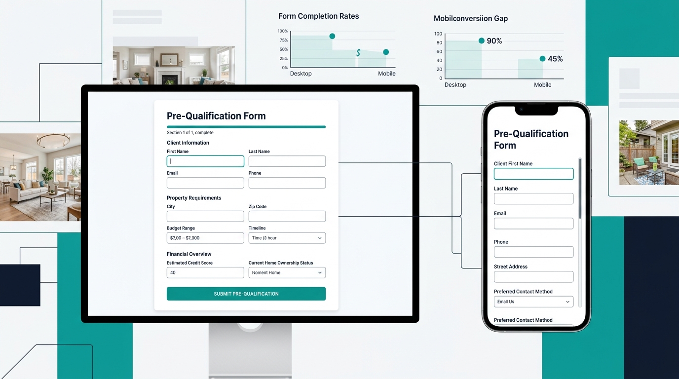
Some agents go the opposite direction from minimal. They build a detailed intake form with seven, ten, even fifteen fields. Pre-approval status. Budget range. Desired move-in date. Neighborhoods of interest. How they heard about you. Whether they’re already working with another agent.
The appeal is obvious. Every submission that comes through gives you enough information to have an intelligent first conversation. You’re not wasting 15 minutes on a phone call discovering that someone is “just looking” with no timeline. The leads who complete a form like this are self-selecting as serious.
Where the math turns against you
Your conversion rate will crater. Fullstory’s research on form abandonment confirms what most agents learn the hard way: every unnecessary field creates friction that pushes visitors toward the exit. When someone abandons your form, they don’t come back and fill out a shorter version. They go to the next agent’s site.
The damage is especially severe on mobile. A fifteen-field form that looks manageable on a desktop monitor becomes an endurance test on a phone. And since the majority of real estate searches now happen on mobile devices, your long form is essentially invisible to a huge portion of your audience.
There’s also a subtler cost: you lose the “warm curious” prospects. These are people who aren’t ready to commit their budget range and timeline to a stranger’s website but would absolutely respond to a well-timed follow-up email or text. By demanding everything upfront, you filter out leads who could have converted with nurturing. Where your CTA buttons sit on the page compounds this problem. If the only call to action leads to a long questionnaire, visitors with casual interest have nowhere productive to go.
A fifteen-field form gives you self-selecting, serious leads. The problem is everyone else — the warm, curious prospects who would have converted with a follow-up email but couldn’t stomach typing their budget into a stranger’s website.
Best fit: Luxury agents, relocation specialists, or anyone working a low-volume, high-value pipeline where each lead gets personal attention. If you typically handle five to ten active clients rather than fifty, a qualifying form saves you hours of phone screening. But know what you’re trading away.
How To Choose Between These Three
This decision is really about your follow-up infrastructure.
If you have an automated lead nurture sequence that scores, segments, and follows up without you touching every submission manually, the minimal form makes sense. Collect volume. Let the system sort it. Your CRM does the qualifying that the form didn’t.
If you’re a solo agent or a small team without heavy automation, the multi-step form hits the sweet spot. You get enough data to prioritize leads without scaring off mobile visitors. Invest the setup time to get the steps right, then watch your form analytics to catch fields that are causing drop-offs.
If your business runs on a small number of high-value transactions and you can afford to lose volume for quality, the qualifying questionnaire earns its keep. Pair it with a secondary, shorter form elsewhere on your site (a “quick question” widget on listing pages, for instance) so you’re not completely shutting the door on early-stage prospects.
Regardless of which structure you pick, run this audit on your existing forms before you rebuild anything:
- Submit your own form on your phone. Time yourself. If it takes more than 45 seconds or requires pinch-zooming, you have a mobile form conversion problem that’s costing you leads right now.
- Check which fields get skipped or abandoned. Tools like Zuko track field-level drop-off. If one field kills 30% of your completions, cut it or move it to a follow-up email.
- Verify what happens after submission. Does the visitor see a confirmation message? Do they get a response within five minutes? The form is only the beginning. If the experience after submission is dead air, even a perfectly optimized form won’t save your pipeline.
The form is the last inch of a mile-long process that started with an ad click, a search result, or a social media post. Getting it right won’t fix a broken follow-up system, and a strong follow-up system can compensate for a mediocre form. But when both work together, the leads reaching your phone are the ones worth picking up, and far fewer of them are slipping out the back door before they ever arrive.